|
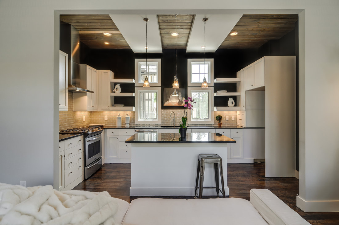
When my social media consultant advised that I use my blog to broadcast some of my favorite paint colors, I hemmed and hawed a bit. These go-to hues aren't "secrets" of mine per se, but they have certainly played significant roles in many of my houses here in Nashville. In the end I decided to spill the beans. Help yourself! I love dark colors, but mostly it's contrast that I love--and how powerfully paint colors can establish a vibe. There are no certain rooms that are better dark, although I do tend to pick the following colors more for dining rooms, master bedrooms, and powder rooms. (I dig a dark powder room!) I typically use a dark color for one of two reasons--to control light, as in a bedroom, where a dark color can really affect mood and inspire sleep, and to create contrast. Especially because my houses have open floor plans, I like to use dark paint to break up the space. For instance, I’m remembering a house we did where the living space was all gray; through a slit you could see the foyer, which ran the length of the house. We painted the foyer black so it read as an accent wall from the main living area. What made it even better: The 11 tiny pin spot lights we scattered randomly across the ceiling to create a twinkling starlight effect. With the dark paint it was nothing short of magical. Another thing to note is that in spite of popular opinion, dark colors don't necessarily make a room look smaller. To the contrary, they recede and give a space mass. I'm not married to any one manufacturer, but I do find that I primarily use Sherwin Williams paints. I think perhaps what each of these colors has in common is that they impart that matte "chalkboard" affect--kind of primitive and sophisticated rolled into one. I've used the six shades below for interiors and exteriors, on cabinetry and on accent walls, essentially everywhere.
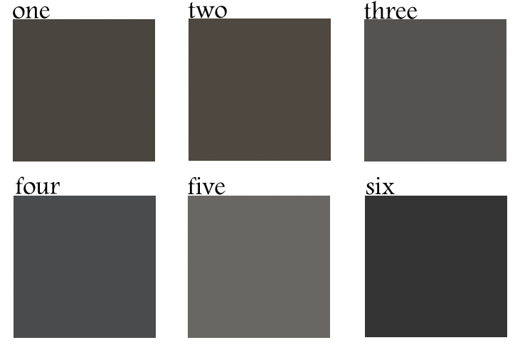
one. Sherwin Williams Sealskin (SW 7675). Among other places, I used this beautiful color in our D. Luxe Home office at Marathon Village, but not without plenty of consideration first. We had maybe seven or eight big blocks of color on the walls before we settled on this one. In the end, we went with Sealskin because I wanted it to read as a heavy contrast against our retail space, which we did in Restoration Hardware's Buttermilk. two. Sherwin Williams Black Fox (SW 7020). This is an amazing color inside or out. I've used this on the exterior of a home that had a lot of cedar shake on it, and the result was phenomenal. three. Restoration Hardware Flint. Because ... Restoration Hardware can really do no wrong. This stunning shade is my favorite of their dark paints. four. Benjamin Moore Wrought Iron (BM 2124-10). I can't tell you how many times I've used Wrought Iron over the years. In fact, that foyer I mentioned in the intro above--I'm pretty sure it was done in Wrought Iron. five. Benjamin Moore Kendall Charcoal (BM HC-166). The shade is a favorite because it reads as a gray or a brown or a green, depending on what you put it with. I like the fact that it’s really super dark but isn’t black. six. Benjamin Moore Jet Black (BM 2120-10). In spite of its name, this color has a lot of dimension and reads like a super dark charcoal black with a matte edge to it. Have you used any of these colors in your home or do you plan to? I want to hear about it! --Dee Bynum
1 Comment
|
Dee BynumDee Bynum has his finger on the pulse. Whether it’s following trends, scouting emerging neighborhoods and infill opportunities, or overseeing the development of a design, Dee’s dedication to—or obsession with—his projects is renowned. Categories
All
|
|
|
615-415-7877
[email protected] © COPYRIGHT 2022. ALL RIGHTS RESERVED.
|


