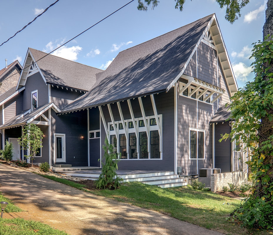
 I was tempted to call this post "Foolproof Exterior Paint Colors," but that would be misleading, because even though I do share 12 of my favorite exterior colors, they were all arrived upon after much hemming and hawing and hand-wringing. So before you take my word for it on any of these paint color selections, read my tips about the process of how to pick the best exterior paint color for your house. 1. Consider the light and the time of day. There’s something about the light, inside versus outside, that makes selecting an exterior color more difficult than an interior color. I guess because we spend so much time inside it’s easier to pull together a paint scheme if you’re in the right light. When you go outside, and you take a color that you love for interiors, and you put it on the outside of a house, it just doesn’t work somehow. And it’s because the light’s different. When I’m picking a color, I’ll go back at different times of the day to see how it does in the changing light. 2. Try as many as six to eight colors. I’m a perfectionist, so I will agonize over finding the right exterior color. I’ll go with all my paint decks and sit there and hold stuff up and stare. We’ll drive contractors crazy because we’ll want six or eight quarts of paint brought over to decide and blocks of color put up. Even then, when you paint a square on a house, you can’t really visualize it because you’re not seeing it related to the color of the trim, or the effect of different light or shadow. 3. Remember where you live. It cracks me up when people in Nashville paint colors on their houses like in Florida or the Caribbean. The light’s different here, so it looks garish. When you’re near the equator it’s a whole different ballgame. What I’m trying to say is: If you see a picture of a beach house on Pinterest that you love, you should not go paint your house in Nashville the same color because it won’t work. The further north you go, that’s going to continue to change, so a color that works well here may not work in Manhattan or Wisconsin. 4. Have patience with the process. Exterior colors are tough. It’s a process, really, to arrive at an exterior scheme. If you throw up a paint scheme on a house and it doesn’t work, you're going to get a sinking feeling every time you pull in the driveway. Take the time to pick out the perfect color. It's worth it. 5. Complement the landscaping. Your paint color has got to be appropriate to both the style of the house and to the landscaping. For instance, if you’ve got tons of landscaping, you don’t want to paint your house blue. That was a tenet of the Craftsman movement---that paint colors should be muted and earth-toned, grounding the house to its surroundings. This means different climates are suitable for different color families. 6. Contrast versus similarity. If you’ve got enough detail on the house, I love having similar colors together on an exterior because it’s subtle, part of the art. If you have a lot of texture on an exterior, I will even sometimes paint a house in one solid color because the shadows create that interest. It really works, especially on a lot of our white houses. There’s no need for a secondary color unless it’s the front door, as we’ve done. 7. Ask a pro for help. Should I tell you some of my secrets? Oh, heck, here are they are. These are 12 of my favorite exterior colors. I hate applying the same answers to more than one project, but we do like to hold on to colors that have been successful for us in case we ever need to come up with a scheme quickly. This makes me sound like I only use Sherwin-Williams colors, which isn't completely true, but which is mostly true. 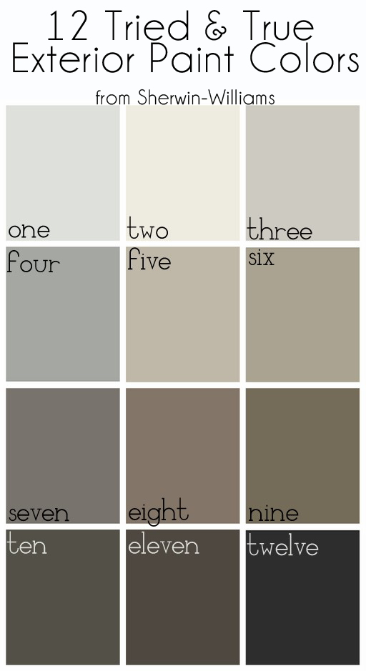
If you live in Nashville and need help selecting an exterior color, we welcome you to call us for a paint consultation.
1 Comment
Because there are, of course, far more than 50 shades of gray, there’s an art to picking just the right one. Here are five of my favorite gray hues--versatile neutrals that steer clear of drab or dreary undertones.  Pictured above is Sherwin Williams's "Argos" in a home we completed on Vaulx Lane Gray is the new beige—although, for the record, I never did meet a beige I loved. Needless to say, I’m far more content to live and work within this particular color trend. More times than not I will slather the whole of an interior in gray. I can’t always find just the right words to explain why I love the paint colors I love. You have to experience a paint color to really know it, but you can trust that I’ve used the five following colors extensively with great results. A couple words of caution: If you choose to use more than one shade of gray in your home, as many people do these days, be very careful not to mix your cools and your warms. Cool grays will have a hint of blue, green, or purple, while warm grays have red, orange, or yellow undertones. Also, you may want to take special care to sample gray shades before committing to a color because this color chameleon can easily go blue or green or purple or beige, which may be exactly what you’re going for—or not. You want to avoid inadvertently painting yourself into a gloomy setting by choosing the wrong shade. One of the things I love about Sherwin Williams paints is that they make sampling colors so easy and provide large 8” X 11” color samples that you can hang on your wall before getting into a longterm relationship with a color. 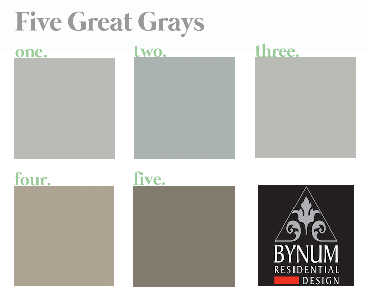 (1) BM Coventry Gray, (2) BM Boothbay Gray, (3) SW Argos, (4) SW Morris Room Grey, (5) SW Anonymous one. Benjamin Moore Coventry Gray (HC-169). This cool gray has a beautiful blue undertone, and though it’s part of the line’s Historic Color collection, it looks decidedly modern in the spaces where I’ve used it.
two. Benjamin Moore Boothbay Gray (HC-165). Dusty and coastal-inspired, Boothbay is one of my go-to gray-with-a-tinge-of-blue colors. Fun fact: Jennifer Lopez’s kitchen cabinets are painted this color. three. Argos from Sherwin Williams (SW 7065). Another cool gray I love, Argos goes blue to silver to gray depending on the light and what’s around it. four. Morris Room Grey (SW 0037). – The first warm gray to make my list, Morris Room is my favorite greige shade, which occurs when you mix black into a warm gray. Greige is an especially popular color for kitchen cabinetry. five. Anonymous Gray (SW 7047). – From its name you’d think this to be a nondescript color, but this warm gray has plenty of punch. Anonymous works great as an exterior color, too. Other grays we love at Bynum Design: Sherwin Williams Gray Matters (SW 7066) and Sherwin Williams Classic French Gray (SW 0077). Looking for a dark paint color to contrast with your gray walls? Check out this blog post on my favorite dark paint colors. And give me any questions you have in the comments below. --Dee Bynum When my social media consultant advised that I use my blog to broadcast some of my favorite paint colors, I hemmed and hawed a bit. These go-to hues aren't "secrets" of mine per se, but they have certainly played significant roles in many of my houses here in Nashville. In the end I decided to spill the beans. Help yourself! 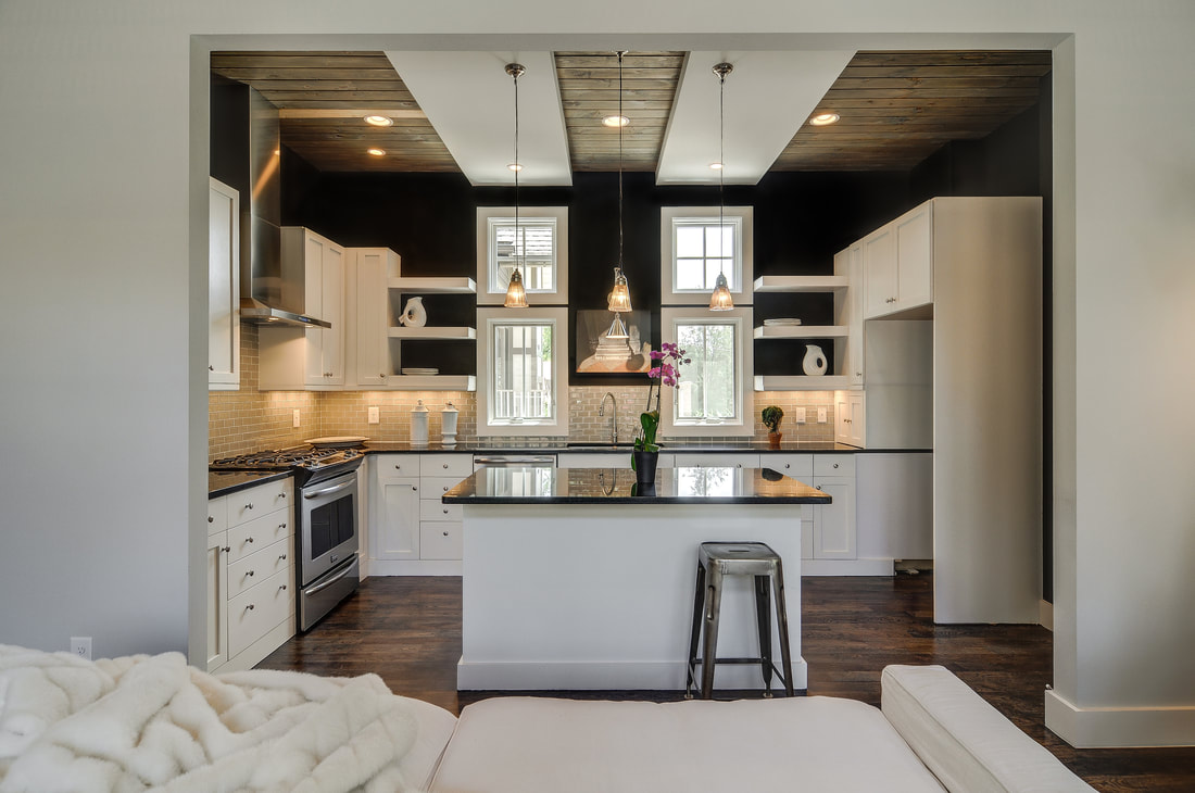 I love dark colors, but mostly it's contrast that I love--and how powerfully paint colors can establish a vibe. There are no certain rooms that are better dark, although I do tend to pick the following colors more for dining rooms, master bedrooms, and powder rooms. (I dig a dark powder room!) I typically use a dark color for one of two reasons--to control light, as in a bedroom, where a dark color can really affect mood and inspire sleep, and to create contrast. Especially because my houses have open floor plans, I like to use dark paint to break up the space. For instance, I’m remembering a house we did where the living space was all gray; through a slit you could see the foyer, which ran the length of the house. We painted the foyer black so it read as an accent wall from the main living area. What made it even better: The 11 tiny pin spot lights we scattered randomly across the ceiling to create a twinkling starlight effect. With the dark paint it was nothing short of magical. Another thing to note is that in spite of popular opinion, dark colors don't necessarily make a room look smaller. To the contrary, they recede and give a space mass. 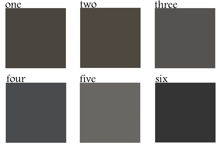 (1) SW Sealskin, (2) SW Black Fox, (3) RH Flint, (4) BM Wrought Iron, (5) BM Kendall Charcoal, (6) BM Jet Black. I'm not married to any one manufacturer, but I do find that I primarily use Sherwin Williams paints. I think perhaps what each of these colors has in common is that they impart that matte "chalkboard" affect--kind of primitive and sophisticated rolled into one. I've used the six shades below for interiors and exteriors, on cabinetry and on accent walls, essentially everywhere.
one. Sherwin Williams Sealskin (SW 7675). Among other places, I used this beautiful color in our D. Luxe Home office at Marathon Village, but not without plenty of consideration first. We had maybe seven or eight big blocks of color on the walls before we settled on this one. In the end, we went with Sealskin because I wanted it to read as a heavy contrast against our retail space, which we did in Restoration Hardware's Buttermilk. two. Sherwin Williams Black Fox (SW 7020). This is an amazing color inside or out. I've used this on the exterior of a home that had a lot of cedar shake on it, and the result was phenomenal. three. Restoration Hardware Flint. Because ... Restoration Hardware can really do no wrong. This stunning shade is my favorite of their dark paints. four. Benjamin Moore Wrought Iron (BM 2124-10). I can't tell you how many times I've used Wrought Iron over the years. In fact, that foyer I mentioned in the intro above--I'm pretty sure it was done in Wrought Iron. five. Benjamin Moore Kendall Charcoal (BM HC-166). The shade is a favorite because it reads as a gray or a brown or a green, depending on what you put it with. I like the fact that it’s really super dark but isn’t black. six. Benjamin Moore Jet Black (BM 2120-10). In spite of its name, this color has a lot of dimension and reads like a super dark charcoal black with a matte edge to it. Have you used any of these colors in your home or do you plan to? I want to hear about it! --Dee Bynum |
Dee BynumDee Bynum has his finger on the pulse. Whether it’s following trends, scouting emerging neighborhoods and infill opportunities, or overseeing the development of a design, Dee’s dedication to—or obsession with—his projects is renowned. Categories
All
|
|
|
|
615-415-7877
[email protected] © COPYRIGHT 2022. ALL RIGHTS RESERVED.
|