|
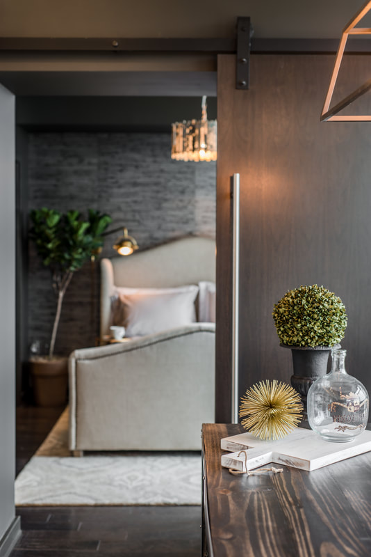
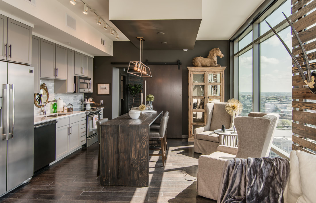
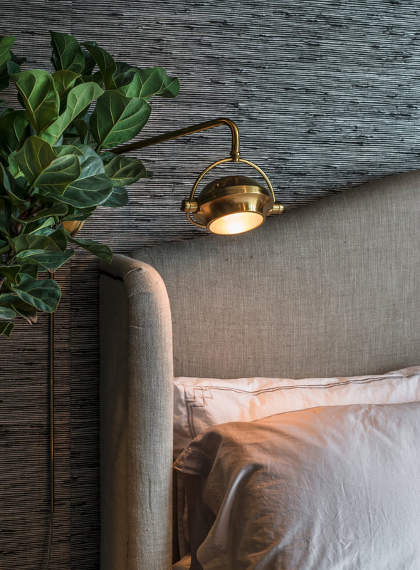
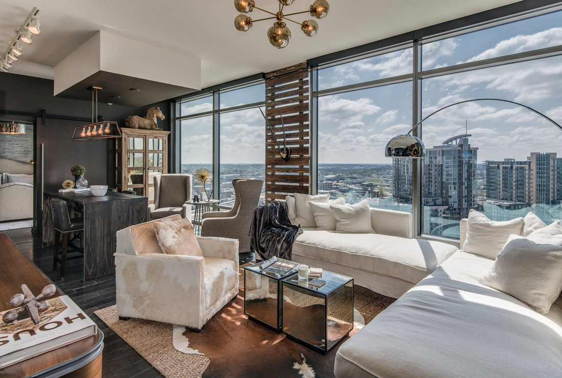
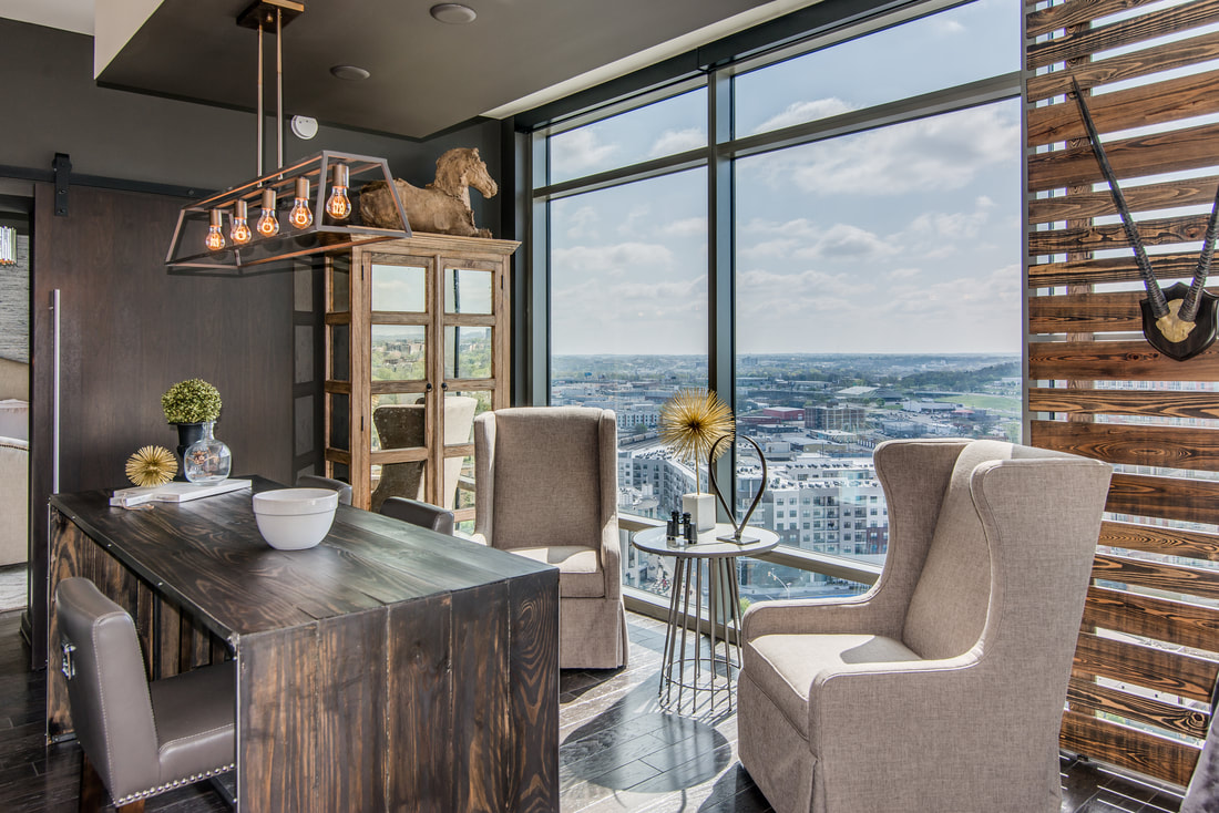
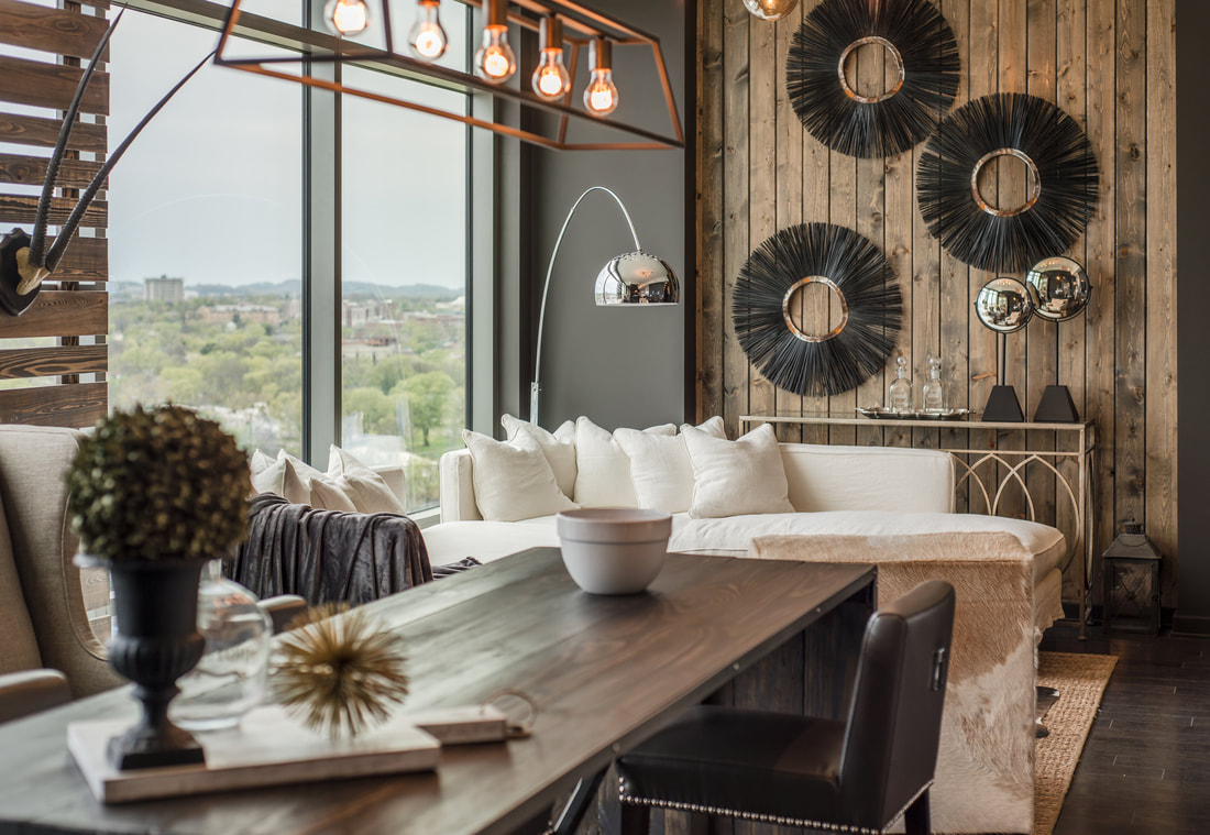
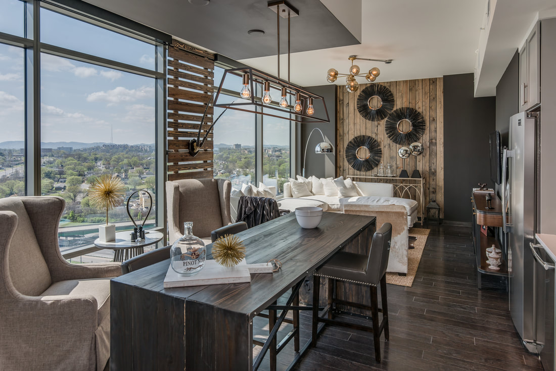
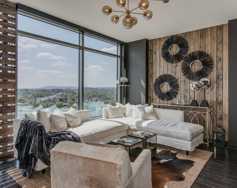
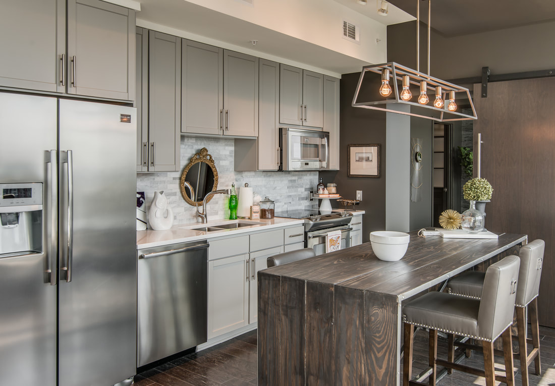
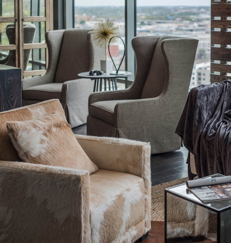
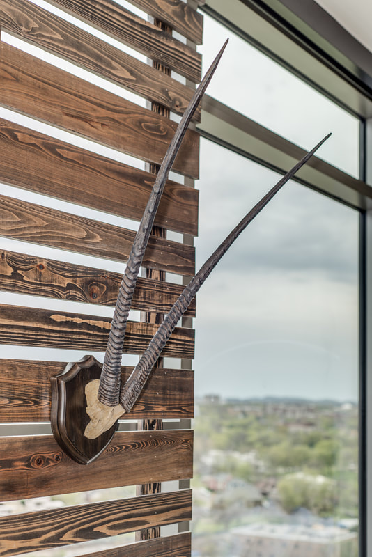
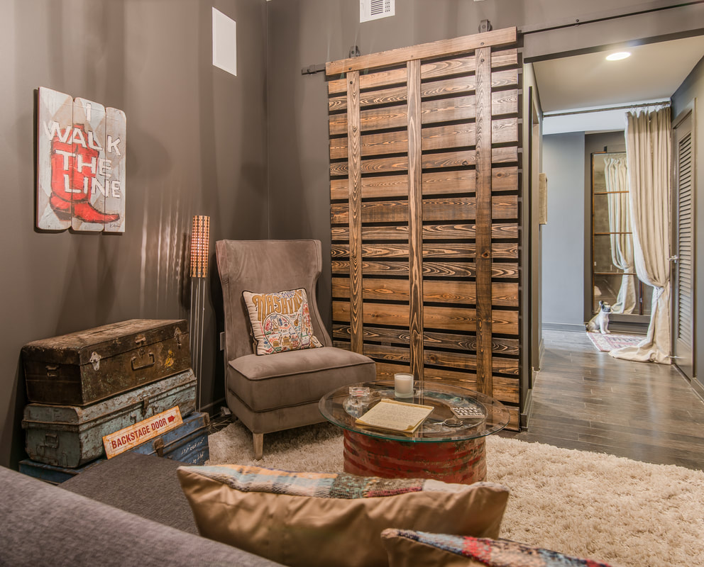
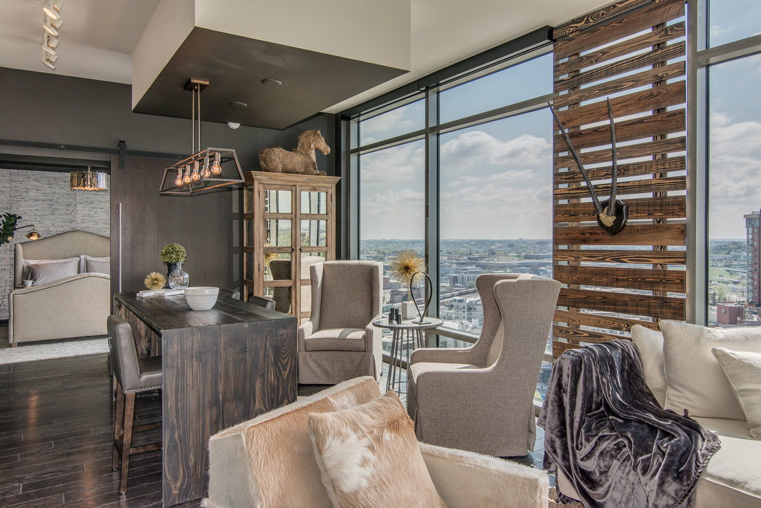
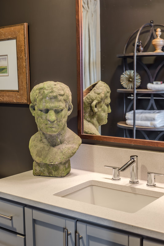
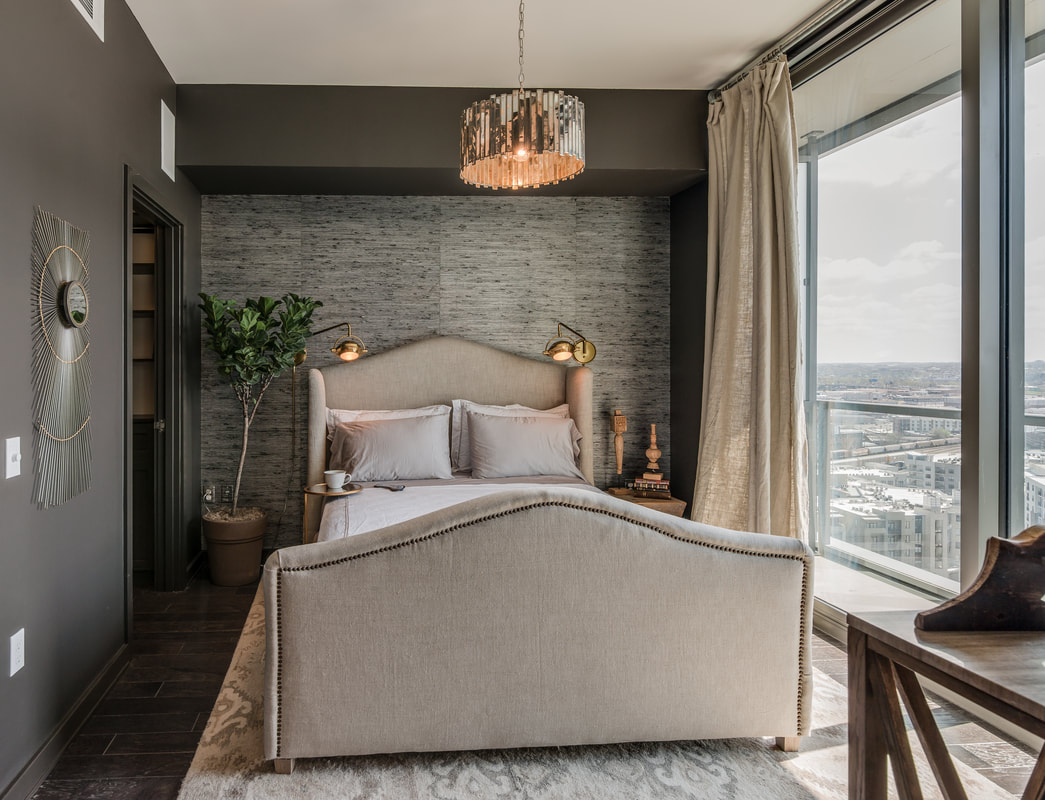
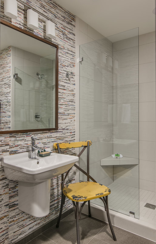
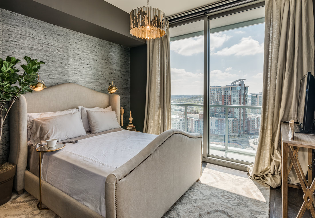
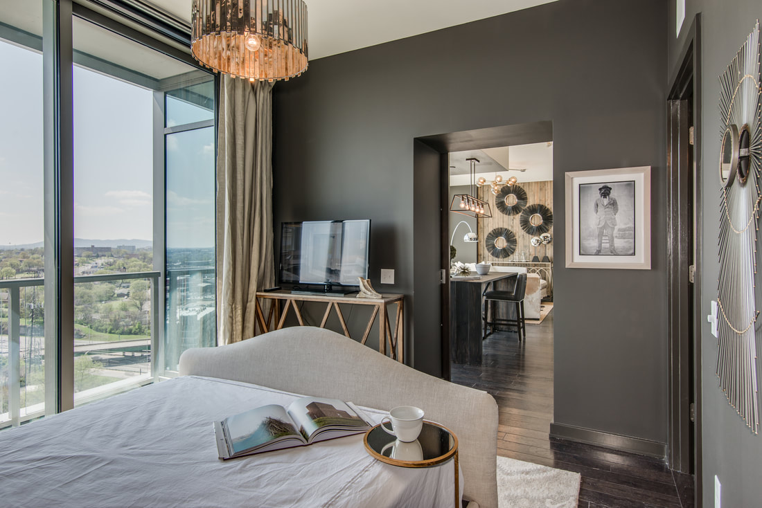
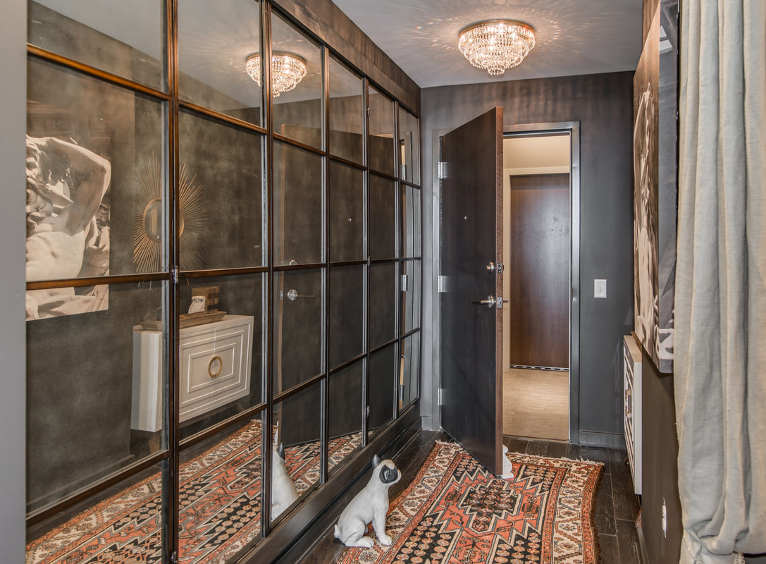
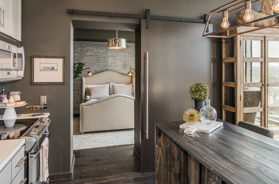
When we were asked to be one of a handful of Nashville interior design teams to stage one of the new Twelve Twelve condos in the Gulch, the builders wanted our help amping up the design drama to help these things sell. It’s worked, as Twelve Twelve is forecasted to be sold out by year’s end. So while we’re happy that we accomplished what we were asked to do, we’re mostly happy that we have this gorgeous space to show for it. And we're grateful to have had photographers StudiObuell to capture it. A couple of months back, we shared our inspiration boards with you. Now, here’s the real deal: It ended up being liberating to not have much square footage to work with (we had two bedrooms, the tiniest of which we repurposed into a Music City-appropriate music room, and two bathrooms). And of course it was helpful that they didn’t just hand us the keys to the castle; they handed us the castle and let us go for it. There were a few things already done, but for the most part we got to select everything from the unit itself to the finish scheme. We were even able to choose a Sonos music system and the TVs. We picked out the rolling window shades, paint colors, and of course all of the furniture and accessories. If you’re curious about any of the above, we sourced most of it from our shop, D. Luxe Home (and we’ve dedicated a separate blog post detailing where everything came from). This project was very much a group effort—with insights and ideas coming from those on-staff at Bynum Design as well as from the fabulous Sally Kyle. We knew from the get-go that it was sophistication we were after. But my overall approach was, at the end of the day, to create a unit where I would want to live. (Speaking of the end of the day, it’s especially sexy up there at night.) Mission accomplished; I could move right in. Had I bought this unit, I would have probably done exactly what we did to it. I think the biggest ah-ha! moment for us in tackling this space was to do the opposite of what most people do when designing a high-rise unit—that is, to center everything around the view. We came to understand that while the view is important—and dazzling—it’s not everything, and we don’t want to be facing it the entire time, so we placed a lot of furniture against the window wall and created several zones in the one main room. Creating a cozy, flexible space was what was most important. We even moved the original location of the TV from the wall they had it on to an inward wall because we wanted you to be looking in, not out. We created a space to watch TV ... We created a space to eat... ... and then we created a separate space with these fab swivel chairs. You can be in one and talking to whoever’s cooking or looking out at THAT VIEW. It is just perfect. Our other prevailing way of thinking about this project was to bring details from the exterior of the building and reference them in our design. For instance, we identified a detail on the building that we really liked above the freight dock; there’s a giant, three-story wall of wood slats, all different widths. At one pint, when we were feeling like the space was just so long and needed to be broken up a bit, we looked to the narrow mullion in the center of the windows and decided that was the prefect place to take that wood slat element and introduce it into the interior. We had this made by a carpenter who specializes in high-rises; who knew that was a specialty?! It turns out that the fact that everything that goes in and out of a high-rise building has to fit inside an elevator requires some extra creative thinking. There was another room—technically a guest bedroom—that didn’t have a door on it. (Since it’s in Nashville we wanted to give the condo a music theme, so we envisioned the second bedroom as a music studio where you would write and play guitar. We’ve got little music motifs everywhere in this condo.) For the music room, we had another one of these wood-slat "thingies" made and hung it on a barn door track. You can see through it, but it gives you the feeling of privacy, and it adds texture in a space that really didn’t have any texture. Another challenge we faced is that this unit didn’t yet have an island or a kitchen table, but it did have soffit on the ceiling that designated where the island was supposed to go, even though we didn’t want to put our island there. We ended up moving the lighting away from where it was originally supposed to be to tighten up the kitchen work area and to give us space to do the thing with the swivel chairs. In the master bathroom all we really had to do is paint the walls super dark, and it popped. So it all flowed, we used the same color throughout the condo, even on the trim, where we used an oil-based paint so that there’s some sheen. The guest bath gave me one of my first opportunities to play with wallpaper, and we selected one made of recycled newspaper shreds. We also used a gorgeous grasscloth wallpaper in the master bedroom on the bed wall. It’s a silk-looking thing that’s the same color of the walls. Finally, in the foyer, we again introduced an element from elsewhere in the building. There’s a lot of aged mirror in the interior design of the building, and we wanted to fully invite the vibe of this building into the unit. Rather than mirroring that whole wall we found these two fabulous screens with three panels each. We mounted them to the wall in the foyer, and put this glam white piece of furniture with gold handles in the alcove opposite it. And of course the crystal chandelier deserves mention. We wanted to wow when you walk in the door, so we swapped out one of the existing can lights for this one. That about covers it. We’re pretty sure it shows, but we had an absolute ball conceptualizing this condo and bringing it to life. For more details on this space and the things inside it, visit our D. Luxe Home blog post or feel free to reach out to us. We are currently accepting Nashville home staging projects and would love to hear from you.
0 Comments
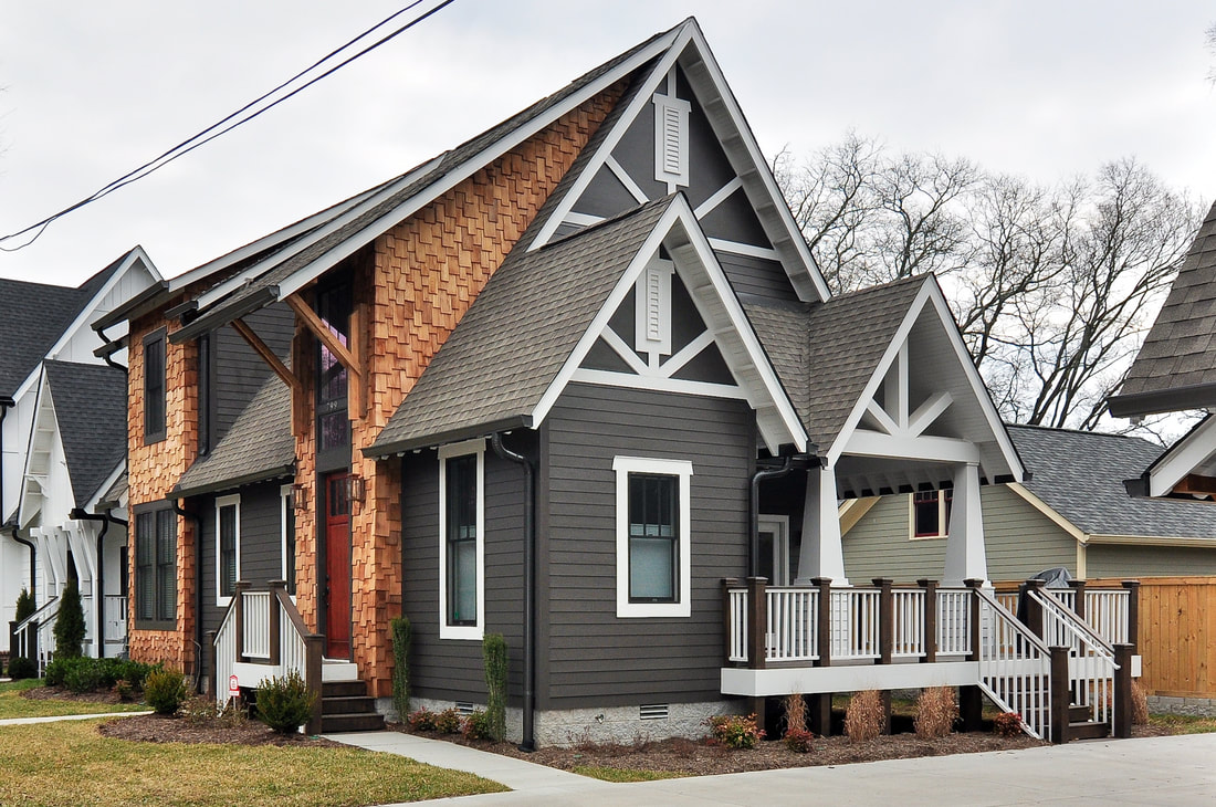
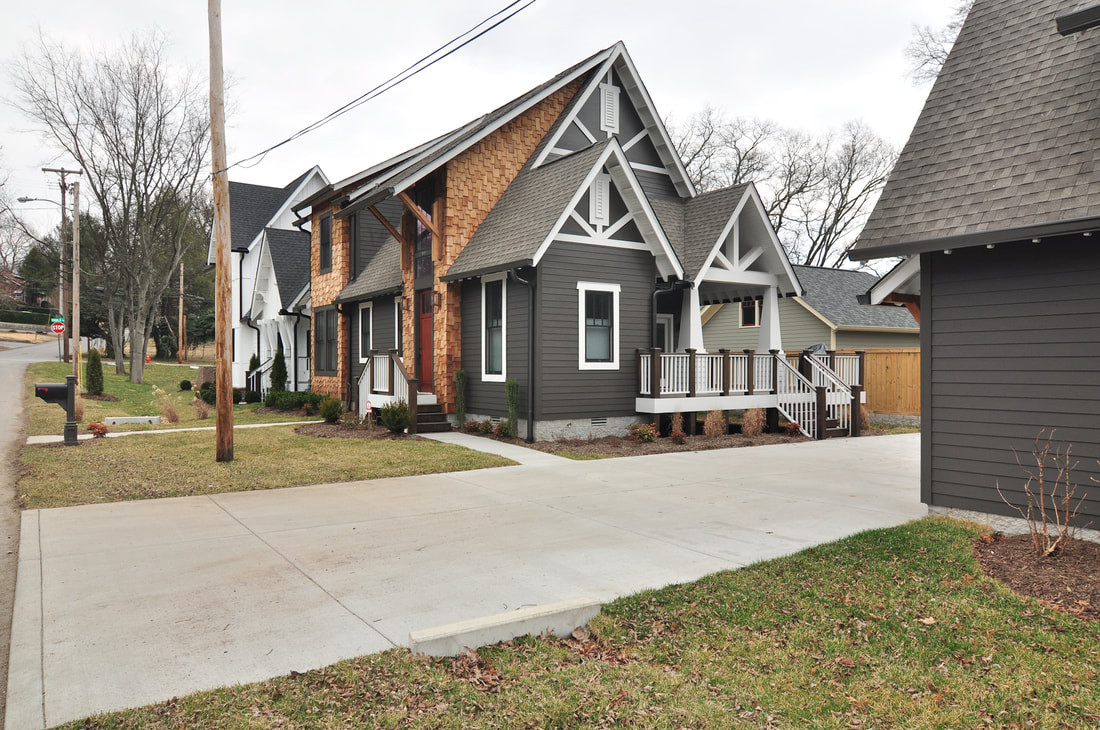
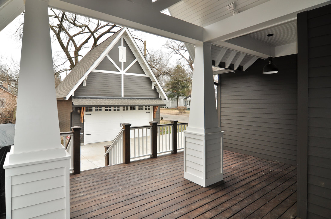
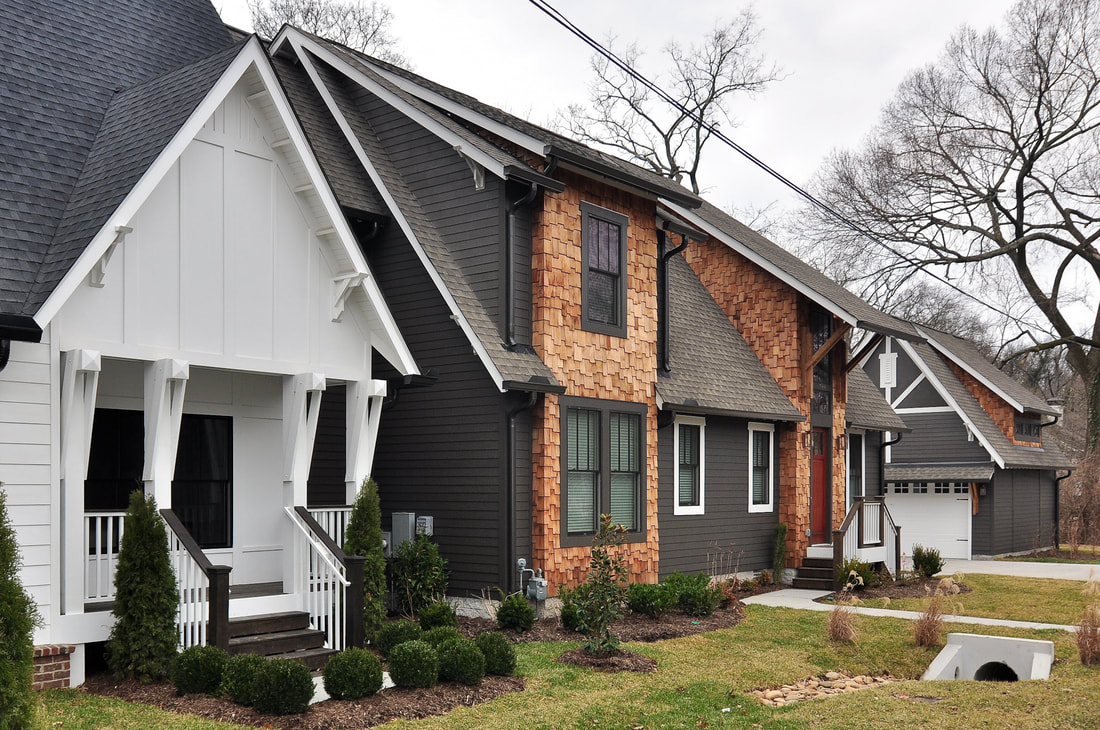
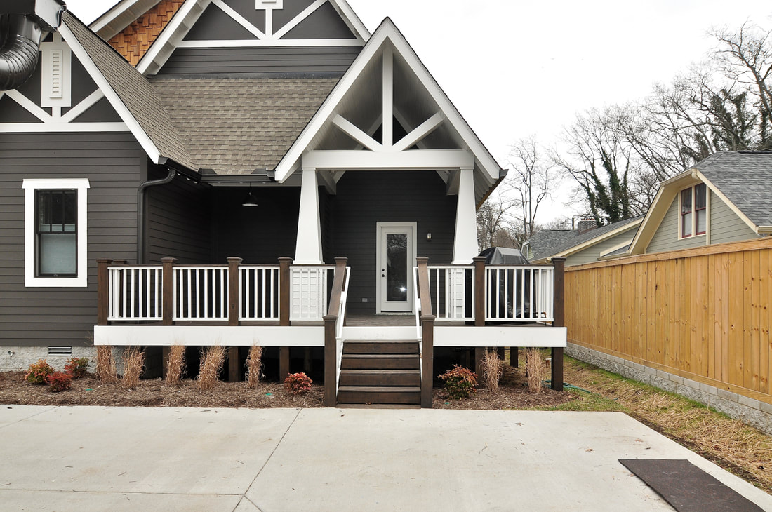
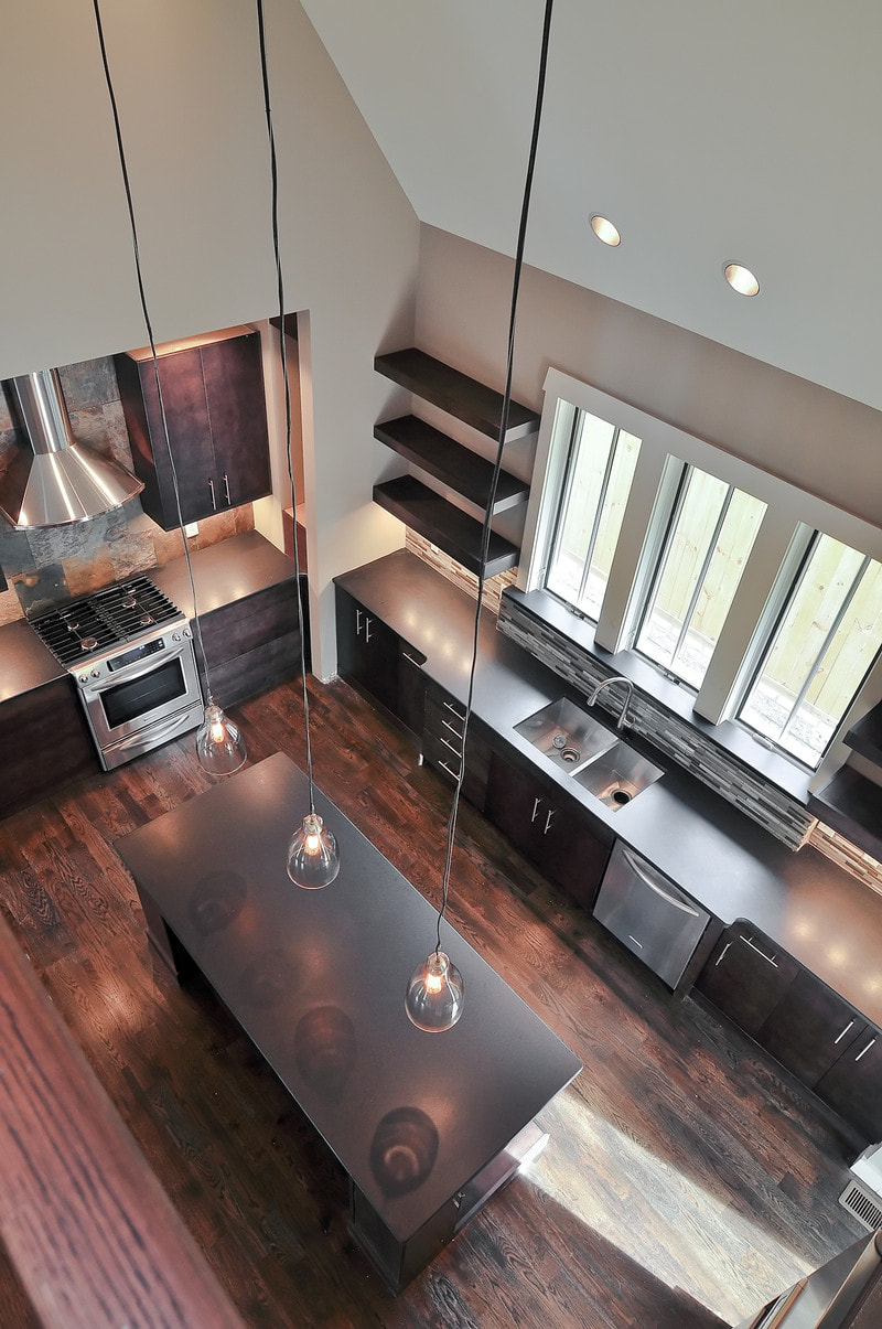
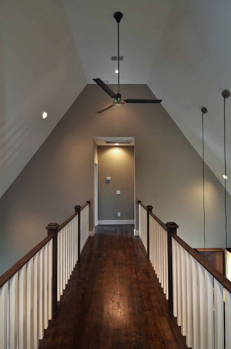
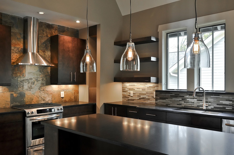
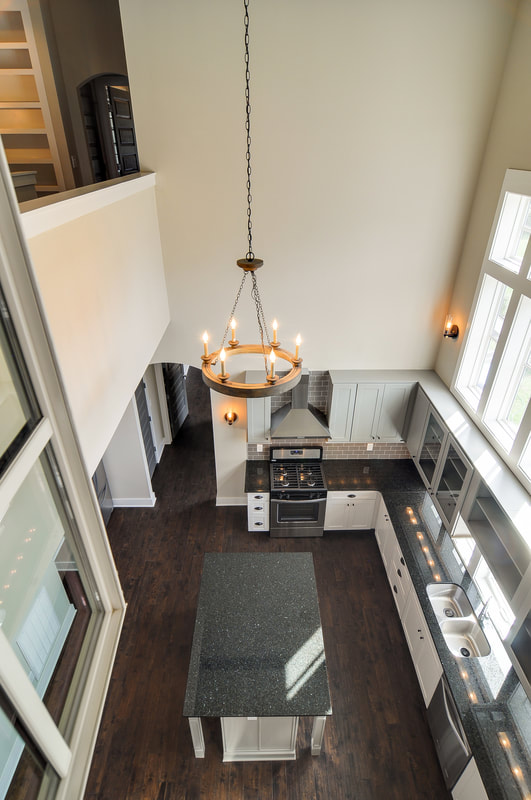
Earlier this year, we told the story of Gretel, one of the two 12South homes we built side by side in 2010, right as Bynum Residential Design was becoming Bynum Residential Design. Now it's time for Hansel's tale. The Process: This house was one of the first houses to offer a different take on the "connector conundrum," which is how to put two beautiful houses on one very desirable Nashville lot and yet have the houses stand apart aesthetically. I had done two houses on one lot in other ways---for instance, on 10th Avenue and Gale Lane, but they were all connected, almost like an apartment building, and we weren't trying to make them different. This is the first time I really tried to change the language of two homes, in spite of their connector. So far as I know, all the builders that had built homes with a connector prior to this made them mirror images. This was a complicated but fun challenge, to come up with two entirely different floor plans and exteriors. But it was an important one for me. We set about creating a masculine and a feminine house. The one we're talking about in this post we called Hansel, and it was to be the man---the dark opposite to the light farmhouse, Gretel, we built next door. What Stands Out: Craftsman Style. Not so long ago, Vaulx Lane was one ugly place. I am very careful to preserve and respect the existing architecture and flow of our streets, but in this case I felt free to create a new language. For Hansel, I used Craftsman details like tapered columns, overlap trim pieces, a Craftsman front door, and modern Craftsman brackets. Even the windows on the garage door supported this Craftsman language. The Trim. I loved playing with the trim on this house, inside and out. Of course, ordinarily the exterior trim would all be the same color, but instead I had some of it painted white (the same white as the Gretel house next door) and then used dark trim on the parts clad in shake siding. That's not a response that most people would have given it. The Entrances. Honestly, the side of the house is a little more dramatic than the front. But this brings up an important point and reminds me of the conversation that we've had so many times with people who want to hire us to change their facades. Somebody will say, 'Can you come talk to us about just changing the front of our house?' And we tend to say, 'Well, the front of your house is no more or less important than the other three sides.' I think all four sides of a house should be equally addressed. So, for this house to have that kind of drama on the side is appropriate because of the approach to the house from the garage. Dark and Dramatic Interior. This wasn't a super big house square-footage-wise, sitting at just over 2,000 square feet, but nonetheless the interior built a lot of drama. It's a two-story space with a bridge that spans above the kitchen. I'm also pleased with the beauty of the master bathroom and its relationship to the style of the rest of the house. And I thought the stairwell was especially pretty. Challenges Faced: Attractive Opposites. We were trying to make these houses opposites, but still complementary in a subtle way. The opposite of light is dark. The style of home is different, the colors are different, and the roofs are different: on one the shingle color is charcoal and on the other it's weathered wood. It was all about making them completely different houses---the antithesis of each other. This was even reflected in the landscaping---one had boxwoods and arborvitaes, and one had more of a Brentwood landscape. One was rolling, and one was flat. It was all part of trying to make them completely opposed. Future Floods. The biggest challenge here was the site because, right before we began building, the Nashville Flood completely covered this area and left many nearby houses submerged. I didn't want anyone to ever have to deal with that again, so we took on a lot of infrastructure stuff here. On the Gretel side of the lot, we created almost a freeform drainage pattern, and put rocks in and planted grasses around it. On the Hansel side, we gave it a flat lawn and made it not-so-freeform, which meant we had to bury pipes and install french drains. Apprehension. My biggest challenge was an emotional one. I wrote about this in the Gretel post, but I didn't know how people would respond to my work. It was scary to put this stuff out there and to see what people thought. It's baring my soul through construction. Happily Ever After. The response to Hansel and Gretel was reaffirming. And it's my hope that it helped establish a new way of thinking about the construction challenges posed by Nashville's connected homes. This home, and the one next to it, was a jumping off point for my career, and I still look back at it with pride. See more photos of this home and other Bynum Residential Design homes on our Facebook page.
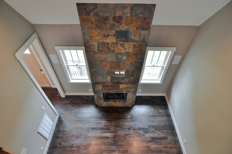
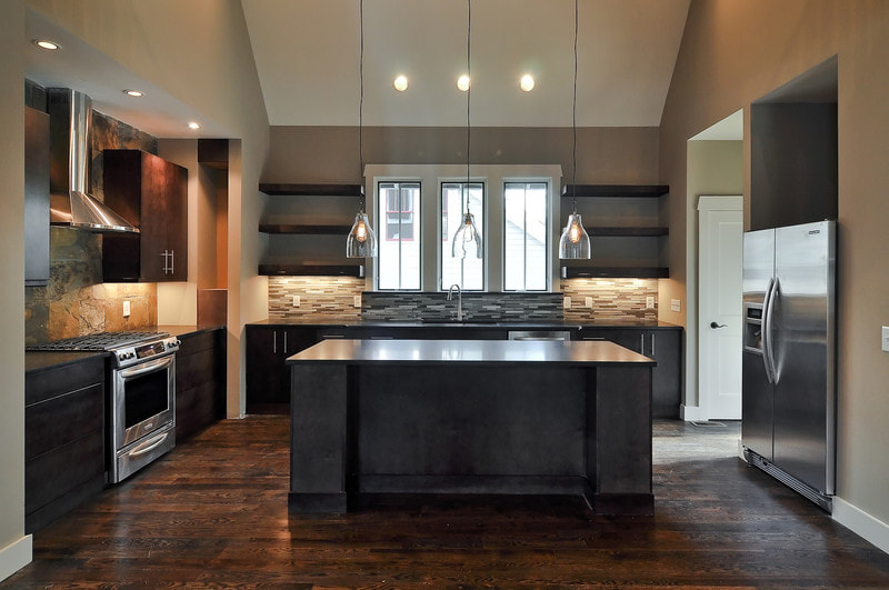
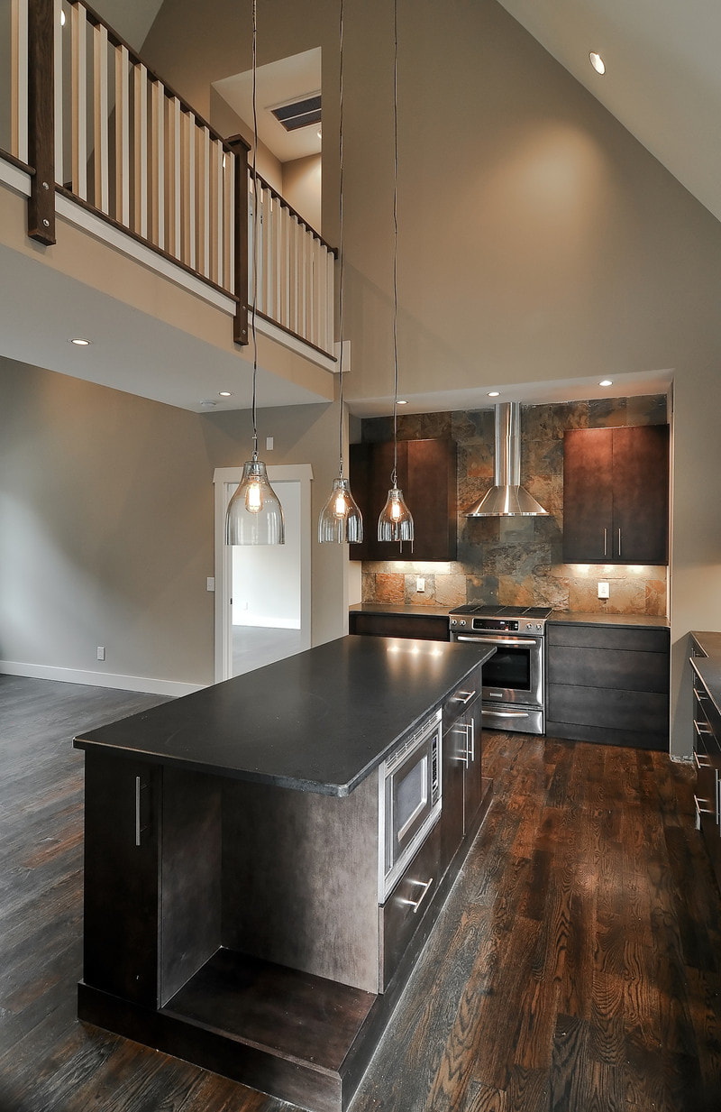
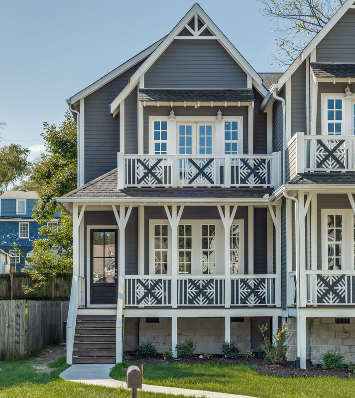
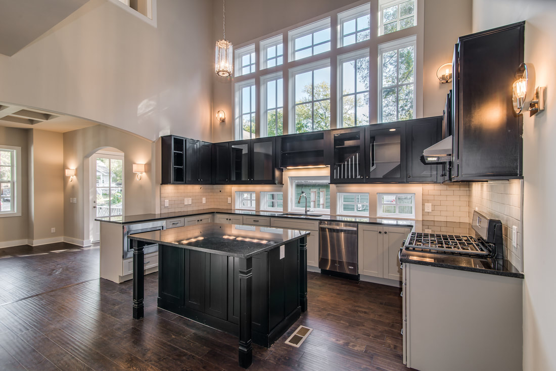
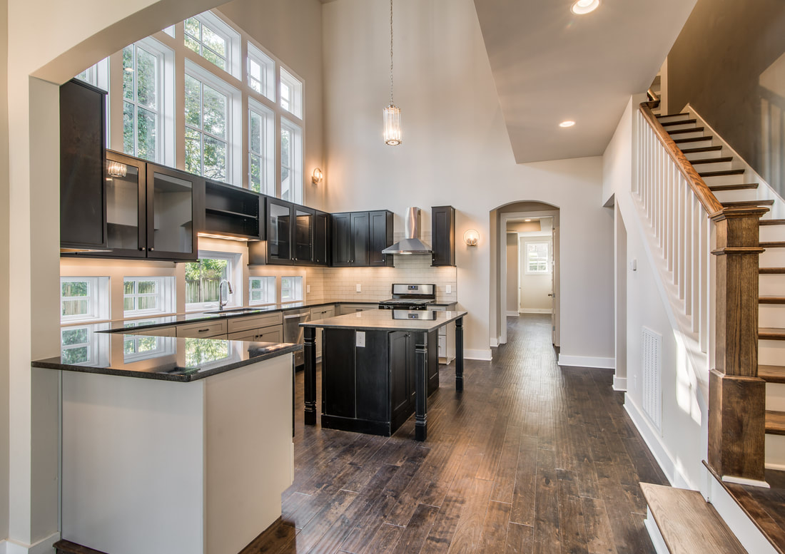
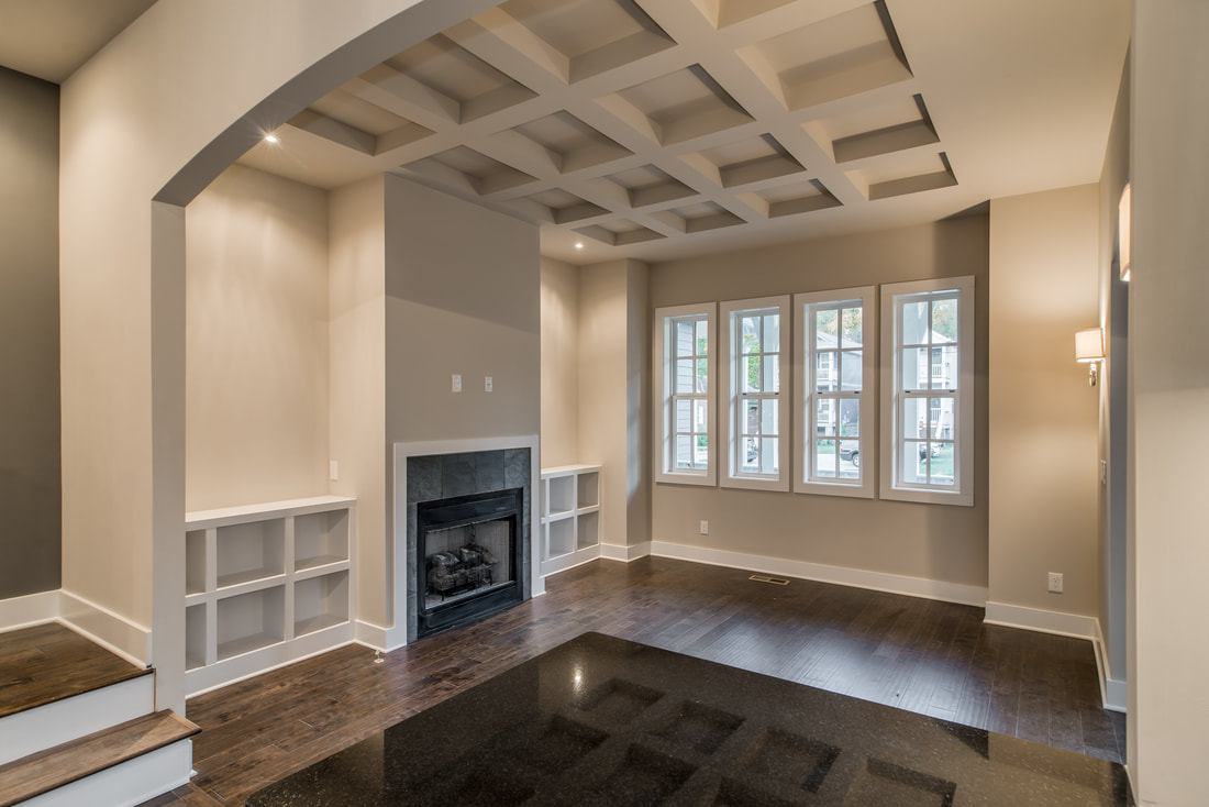
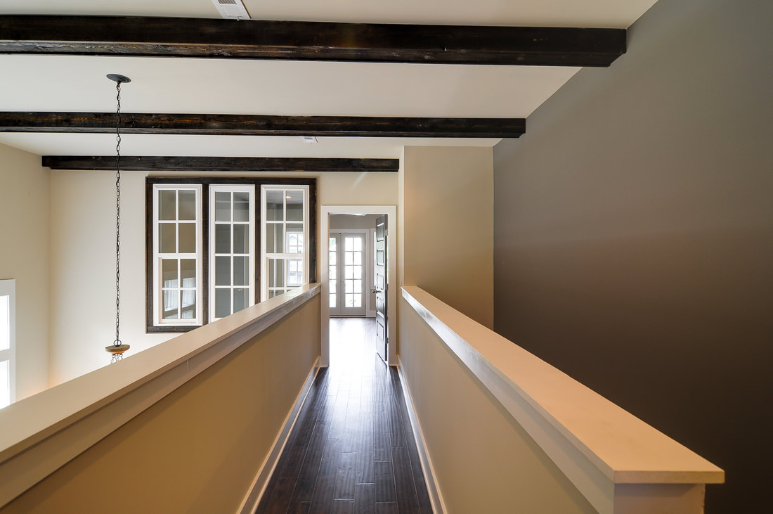
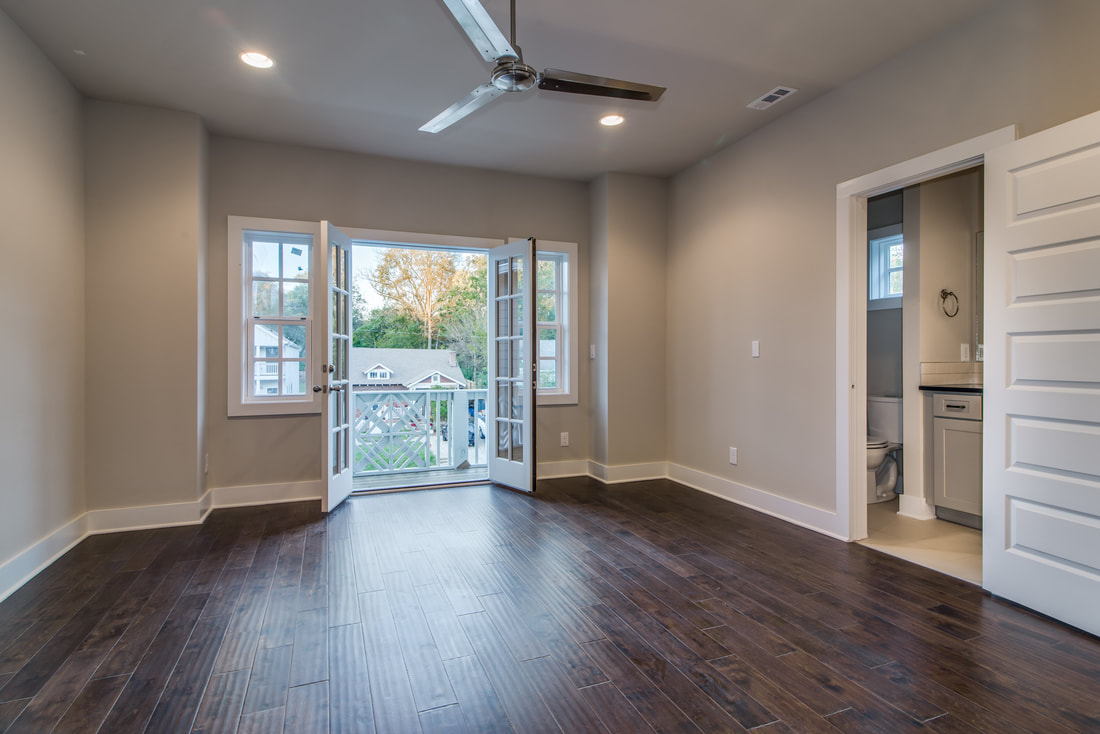
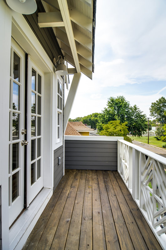
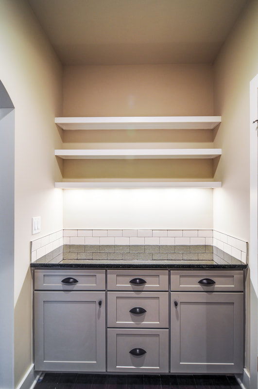
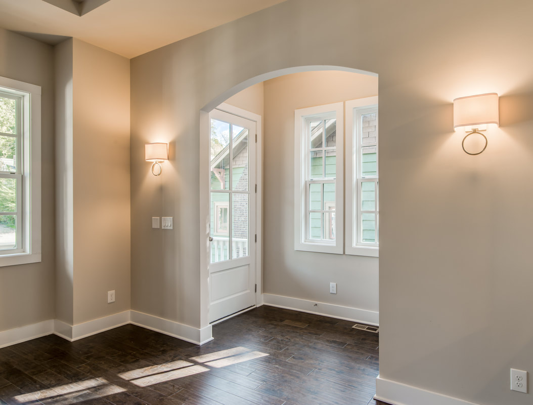
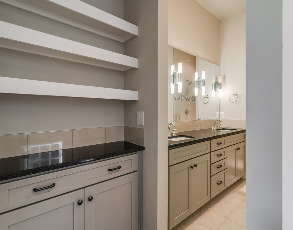
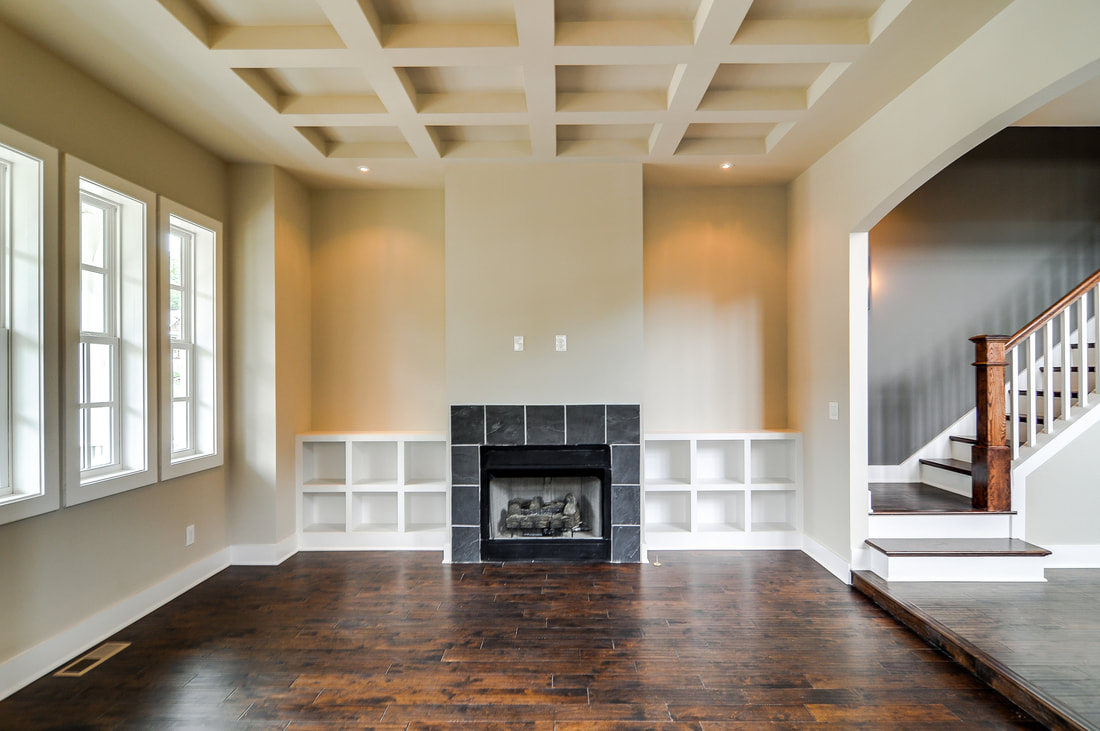
We know. We're late to the party. Better late than never, this project represents Bynum Design’s baptism into East Nashville. As our first new construction on the east side, it gave us occasion to get to know this sweet neighborhood, lined with the old houses that inspire us and the diversity we remember feeling excited about in 12South a decade ago. The Process: We built these two houses---situated side by side and separated by a firewall---for Prime Nashville, a developer that specializes in contemporary real estate. They reached out to us because they said they wanted to step up their design a little bit; we were up to the task. These homes are mirror images and staggered, so one has a bigger front yard and the other a bigger backyard. Throughout this post we've interspersed photos of both of the homes, which are certainly similar but also special in their own ways. What Stands Out: The Kitchens. We are known for our sleek and stunning kitchens---as are, really, most designers who are worth their salt---but these have especially garnered a lot of attention with their sky-high ceilings and a wall of windows. Normally you just get one window over the sink, so you can imagine that a quantity of windows like this proved expensive and caused our developer some pain. (Worth every penny.) The only thing I regret about these kitchens is that we didn’t put in even more windows. I wish they were behind the cabinets, too, so that they would have glass both in front of and behind the cabinets. The Ceilings. Budget constraints didn't allow us to play with the ceilings as much as we would have liked to, but we were able to add beams upstairs and coffer a ceiling downstairs. Notice in the photo below that we also did a trio of skinny interior windows---another Bynum Design trademark. Urban Outdoor Spaces: If you read our recent blog post on designing outdoor living spaces, you know we are just as into exteriors as we are interiors. Both of these houses have a "party deck" upstairs on the front of the house, and a deck and an outdoor patio on the back. The Master Bedrooms: We were able to put double master bedrooms in each house---one upstairs and downstairs---and one of our favorite details is that the upstairs masters have coffee bars right off of them. Challenges Faced: A Narrow Lot: These houses had to be narrow to fit onto a 50-foot wide lot, which meant they needed to be built side by side with a firewall separating them. We had to design around that reality but also needed to give these spaces pizzazz and personality as soon as you walked in the door. A Small Footprint: Our biggest challenge was to hit a small square footage number---we were alloted 1,895 square feet each---and yet still lend these homes a lot of our drama. When you vault the ceilings in a space, it naturally subtracts square footage from the second floor, so it creates a puzzle: How do you make the footprint big enough on the first floor so that by the time you get all of that cut out on the second floor, you’re still at your target? We want to know: What's your favorite thing about our Sharpe homes? Our favorite part was starting the process of getting to know East Nashville. We'll be back soon.
|
Dee BynumDee Bynum has his finger on the pulse. Whether it’s following trends, scouting emerging neighborhoods and infill opportunities, or overseeing the development of a design, Dee’s dedication to—or obsession with—his projects is renowned. Categories
All
|
|
|
615-415-7877
[email protected] © COPYRIGHT 2022. ALL RIGHTS RESERVED.
|
