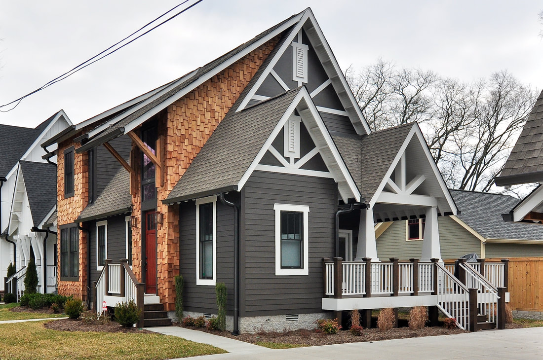
 Earlier this year, we told the story of Gretel, one of the two 12South homes we built side by side in 2010, right as Bynum Residential Design was becoming Bynum Residential Design. Now it's time for Hansel's tale. The Process: This house was one of the first houses to offer a different take on the "connector conundrum," which is how to put two beautiful houses on one very desirable Nashville lot and yet have the houses stand apart aesthetically. I had done two houses on one lot in other ways---for instance, on 10th Avenue and Gale Lane, but they were all connected, almost like an apartment building, and we weren't trying to make them different. This is the first time I really tried to change the language of two homes, in spite of their connector. So far as I know, all the builders that had built homes with a connector prior to this made them mirror images. This was a complicated but fun challenge, to come up with two entirely different floor plans and exteriors. But it was an important one for me. We set about creating a masculine and a feminine house. The one we're talking about in this post we called Hansel, and it was to be the man---the dark opposite to the light farmhouse, Gretel, we built next door. 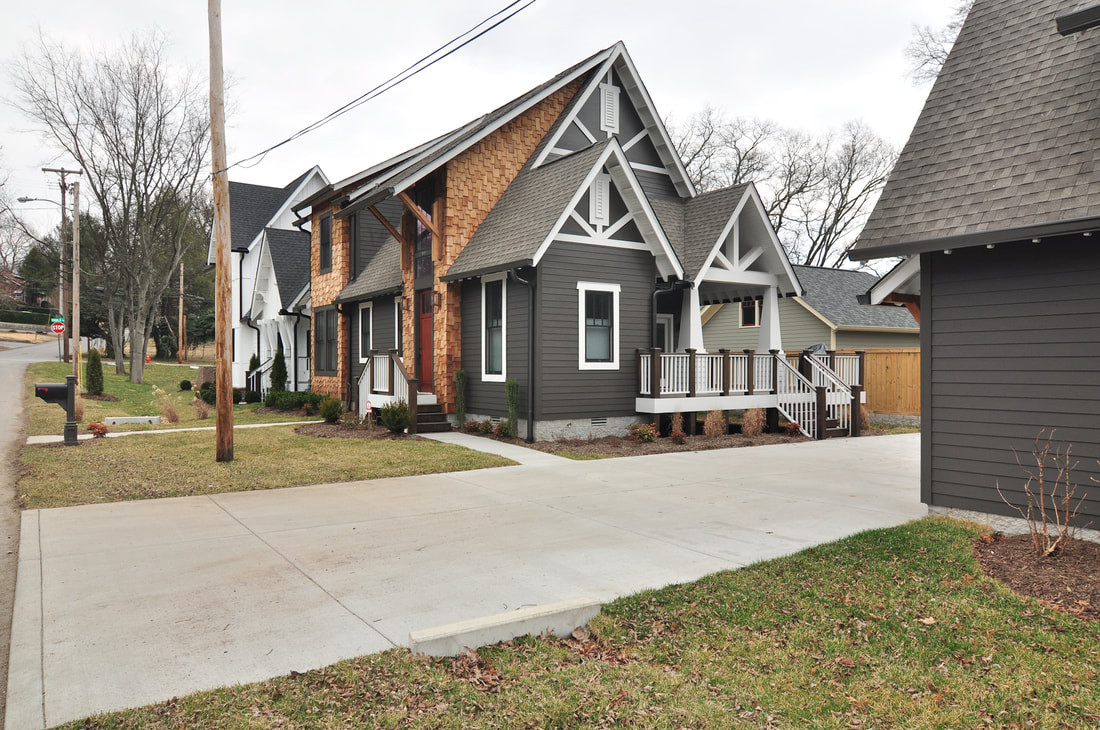 What Stands Out: Craftsman Style. Not so long ago, Vaulx Lane was one ugly place. I am very careful to preserve and respect the existing architecture and flow of our streets, but in this case I felt free to create a new language. For Hansel, I used Craftsman details like tapered columns, overlap trim pieces, a Craftsman front door, and modern Craftsman brackets. Even the windows on the garage door supported this Craftsman language. 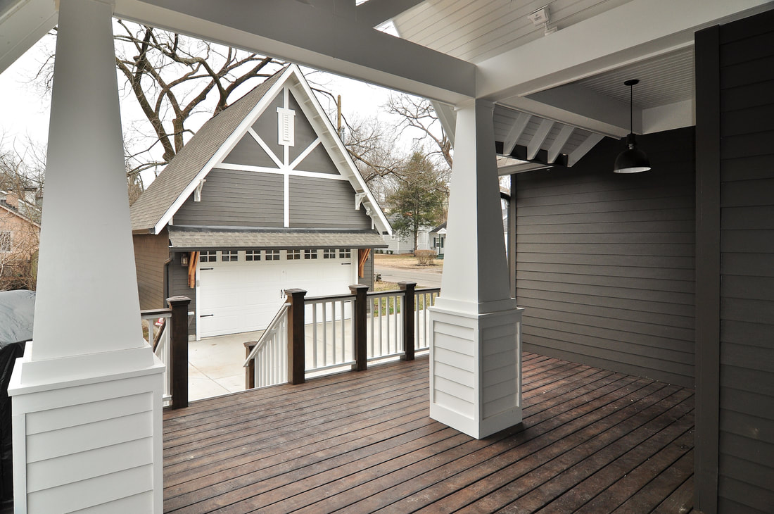 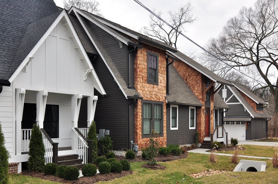 The Trim. I loved playing with the trim on this house, inside and out. Of course, ordinarily the exterior trim would all be the same color, but instead I had some of it painted white (the same white as the Gretel house next door) and then used dark trim on the parts clad in shake siding. That's not a response that most people would have given it. 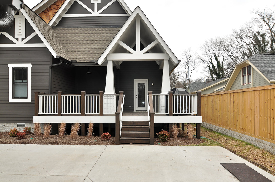 The Entrances. Honestly, the side of the house is a little more dramatic than the front. But this brings up an important point and reminds me of the conversation that we've had so many times with people who want to hire us to change their facades. Somebody will say, 'Can you come talk to us about just changing the front of our house?' And we tend to say, 'Well, the front of your house is no more or less important than the other three sides.' I think all four sides of a house should be equally addressed. So, for this house to have that kind of drama on the side is appropriate because of the approach to the house from the garage. 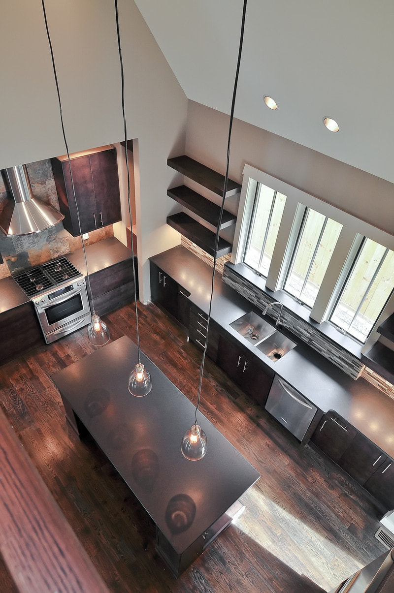 Dark and Dramatic Interior. This wasn't a super big house square-footage-wise, sitting at just over 2,000 square feet, but nonetheless the interior built a lot of drama. It's a two-story space with a bridge that spans above the kitchen. I'm also pleased with the beauty of the master bathroom and its relationship to the style of the rest of the house. And I thought the stairwell was especially pretty. 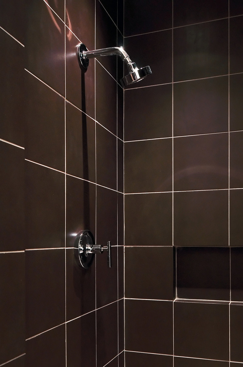 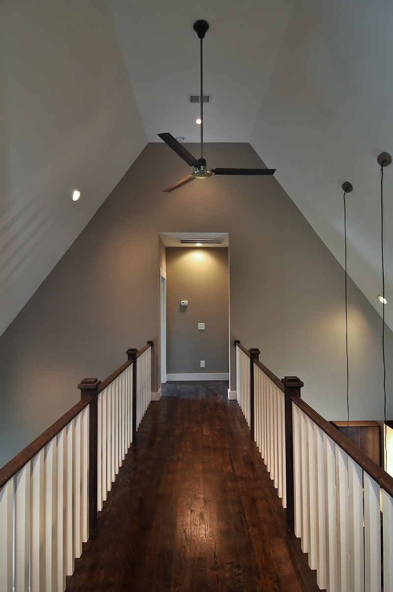 Challenges Faced: Attractive Opposites. We were trying to make these houses opposites, but still complementary in a subtle way. The opposite of light is dark. The style of home is different, the colors are different, and the roofs are different: on one the shingle color is charcoal and on the other it's weathered wood. It was all about making them completely different houses---the antithesis of each other. This was even reflected in the landscaping---one had boxwoods and arborvitaes, and one had more of a Brentwood landscape. One was rolling, and one was flat. It was all part of trying to make them completely opposed. 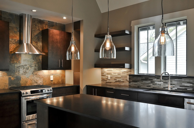 Future Floods. The biggest challenge here was the site because, right before we began building, the Nashville Flood completely covered this area and left many nearby houses submerged. I didn't want anyone to ever have to deal with that again, so we took on a lot of infrastructure stuff here. On the Gretel side of the lot, we created almost a freeform drainage pattern, and put rocks in and planted grasses around it. On the Hansel side, we gave it a flat lawn and made it not-so-freeform, which meant we had to bury pipes and install french drains. 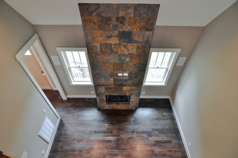 Apprehension. My biggest challenge was an emotional one. I wrote about this in the Gretel post, but I didn't know how people would respond to my work. It was scary to put this stuff out there and to see what people thought. It's baring my soul through construction. 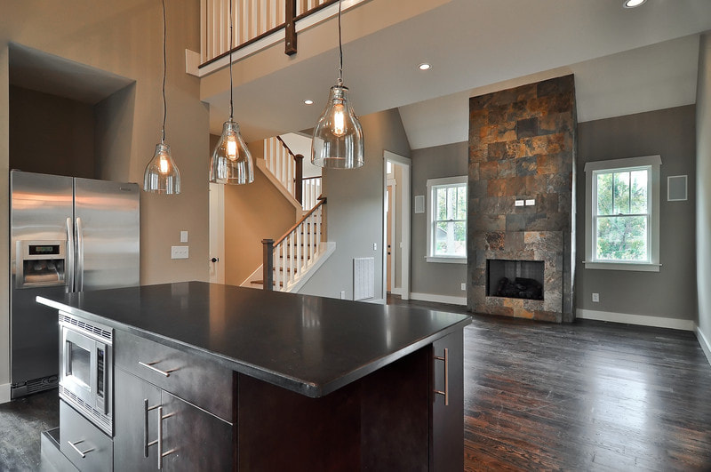 Happily Ever After. The response to Hansel and Gretel was reaffirming. And it's my hope that it helped establish a new way of thinking about the construction challenges posed by Nashville's connected homes. This home, and the one next to it, was a jumping off point for my career, and I still look back at it with pride. 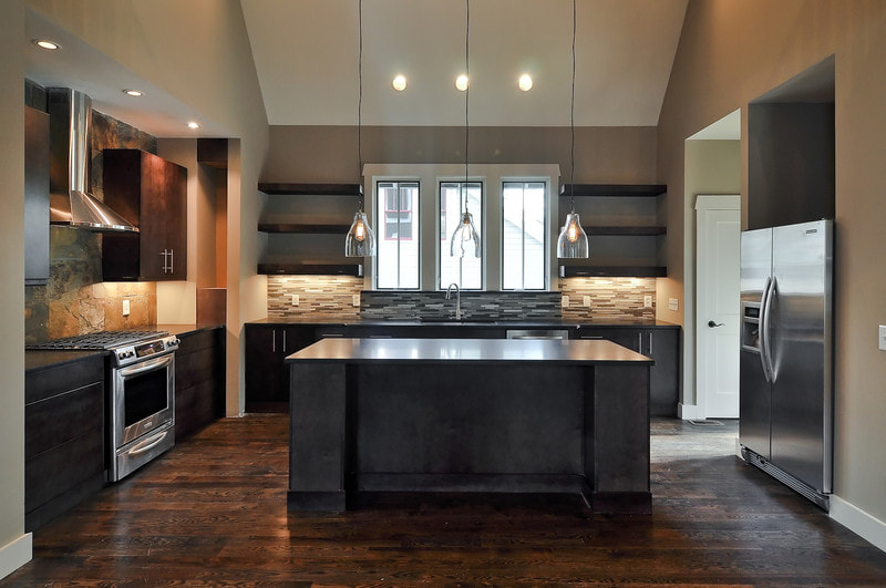  See more photos of this home and other Bynum Residential Design homes on our Facebook page.
0 Comments
We---and most homebuyers, it seems---are nuts for vaulted spaces. However, since space in Nashville is at a premium and many lots these days are narrow as can be, we also have to be nuts about two- and sometimes three-story houses. So, the question becomes how to achieve big, airy cathedral ceilings without losing too much of that precious square footage or sacrificing flow upstairs? For us, the "interior bridge" has been a solution more than a few times. Not only does it get people from point A to point B upstairs, leaving lots of space for light from recessed lights, skylights, chandeliers, and stacks of windows on either side of the home, but it also creates effortless drama. Evoking a drawbridge over a moat in some cases, an interior bridge can have a castle effect. After all, sky-high ceilings like these were once only found in cathedrals and basilicas. In the modern home, they serve as a gesture of grandeur. 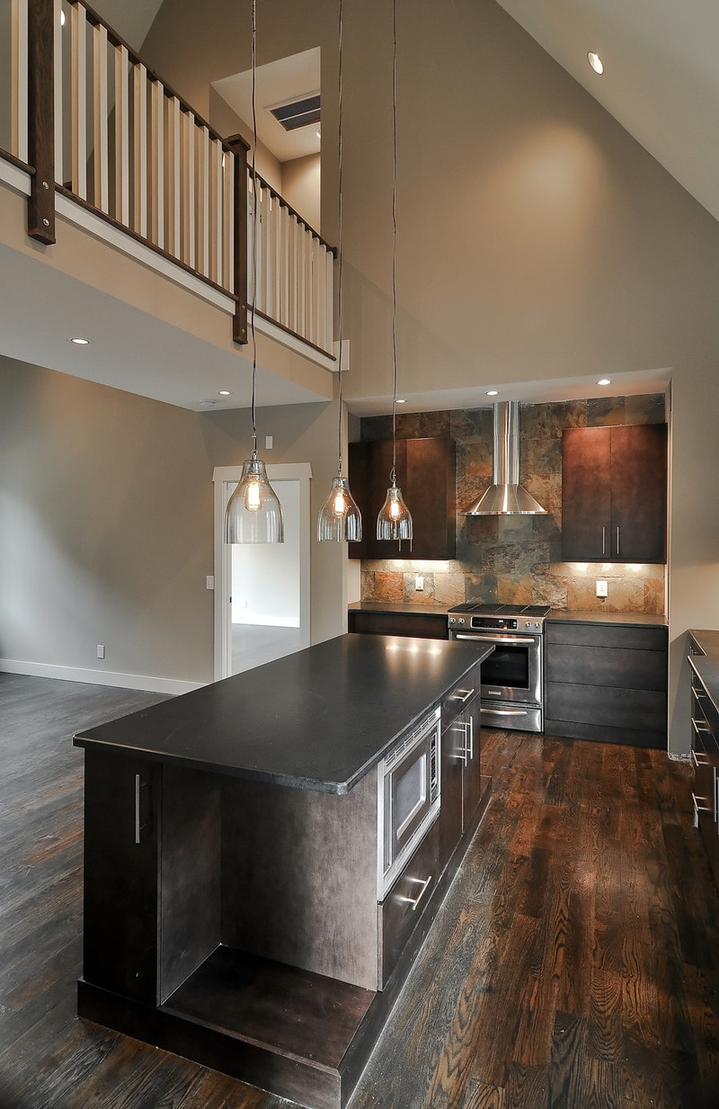 A bridge can also help to section off a house, so that, for example, on one side is a master suite, while another side holds an office and a guest bedroom. At the same time, these bridges allow the upstairs and downstairs to feel more connected. It's much easier to call downstairs, "Honey, can you bring me a beer next time you come this way?", for instance, when your upstairs looks directly into your kitchen. 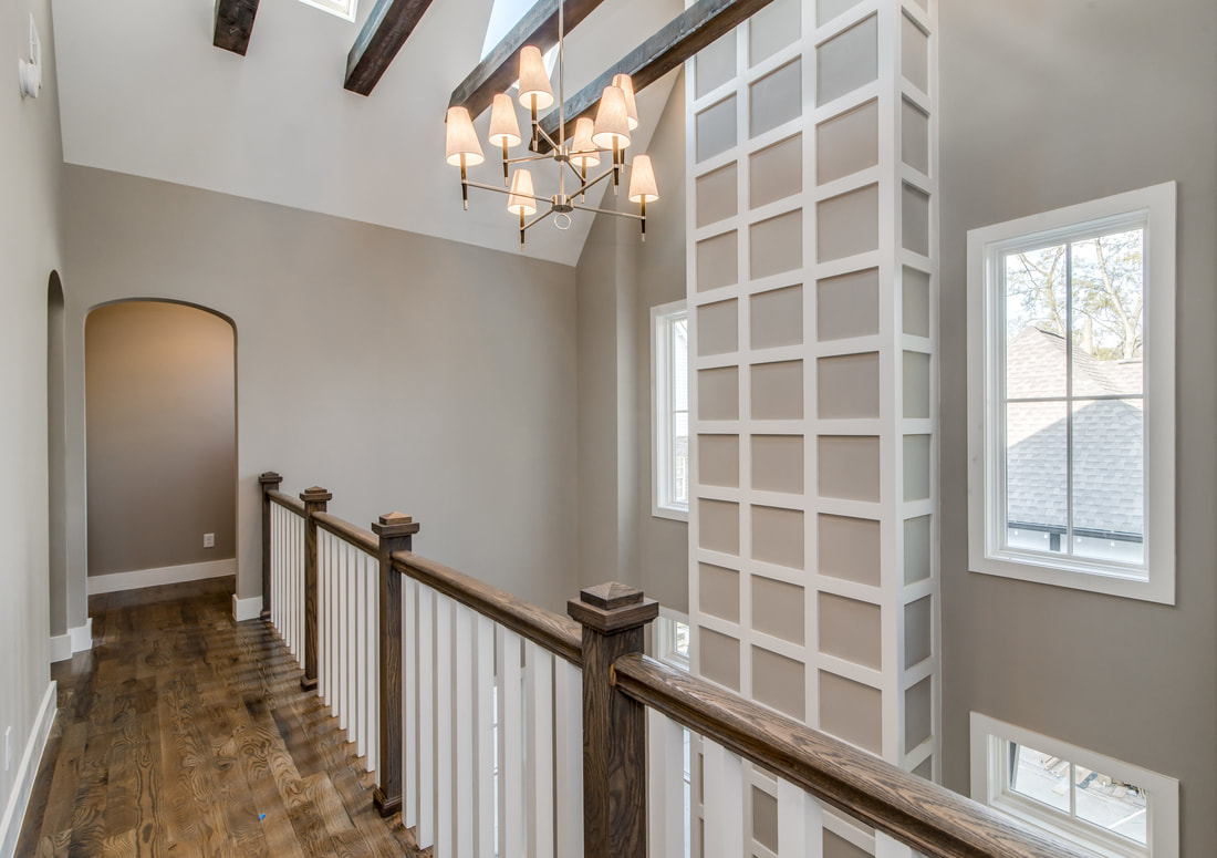 Of course, not everyone is crazy about the vaulted ceiling. Though it is generally regarded as a luxury in that it allows the illusion of extra space without actually making the most of it, it has been faulted for eating up energy. Others still associate these ceilings with the '80s and '90s, when excess ruled so many schools of thought. Like anything, a vaulted ceiling can be done poorly. Just imagine the vaulted ceiling from a few decades ago, covered in that popcorn texture. 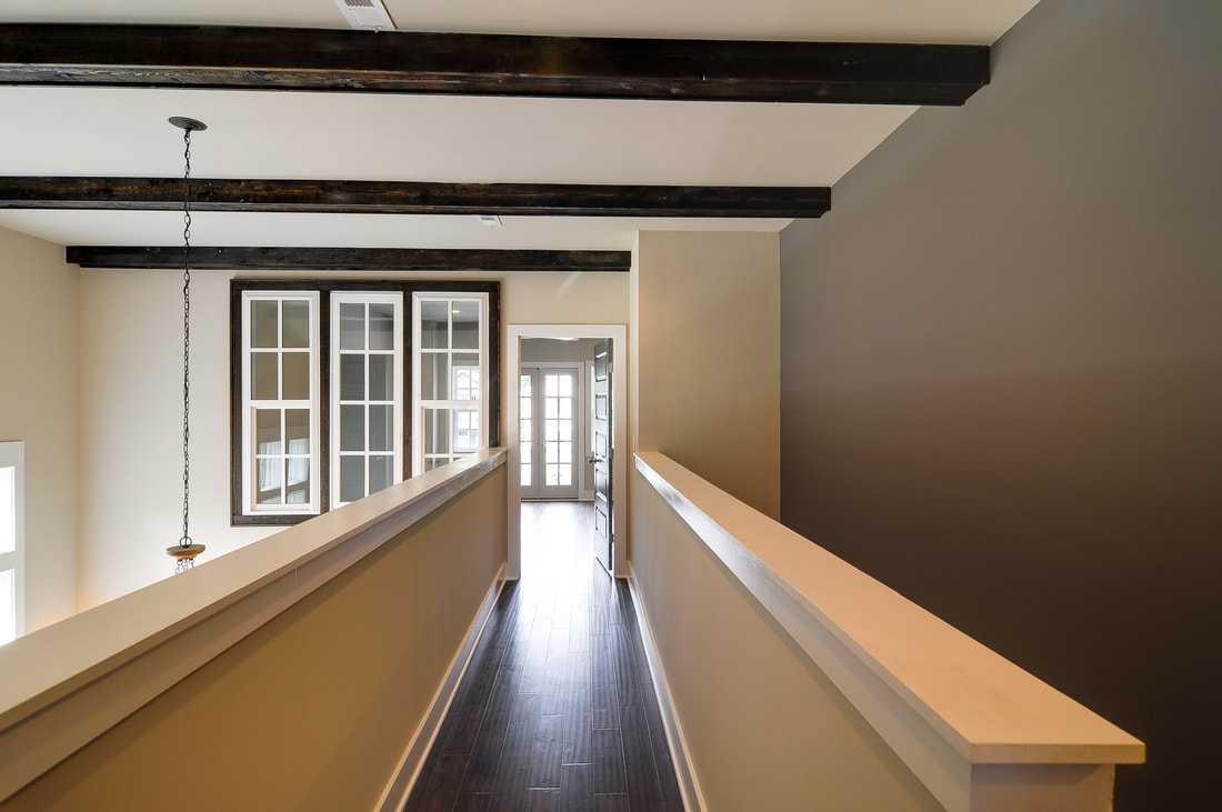 Perhaps our favorite thing about an interior bridge is the vantage point it allows. From an interior bridge, one may be able to peer down into a kitchen or a living space, to catch sight of a spectacular light fixture or accent wall, to truly get "the lay of the land." Vaulted ceilings allow ceiling beams and trusses to take center stage in a home, and all this extra vertical space can give a large art canvas or even an indoor tree a place to flourish. 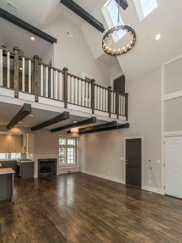 These bridges also offer lots of room to play with materials. We tend to keep our bridges pretty traditional, with dark stained wooden banisters and white painted rails, but in more modern spaces we have seen glass-floored bridges and all kinds of appealing railing options. 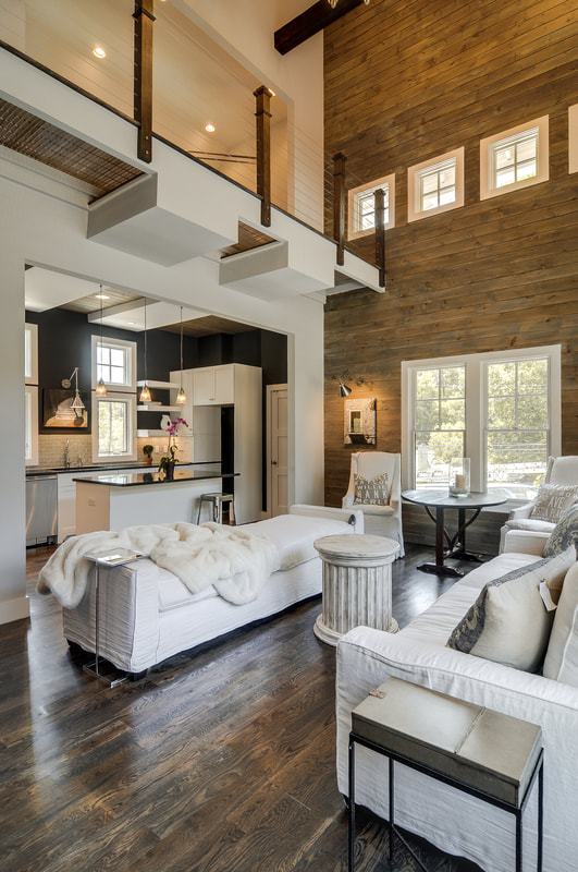 All of the photos in this post are spaces by Bynum Design in Nashville, Tennessee.
Are you a fan of interior bridges? We know. We're late to the party. Better late than never, this project represents Bynum Design’s baptism into East Nashville. As our first new construction on the east side, it gave us occasion to get to know this sweet neighborhood, lined with the old houses that inspire us and the diversity we remember feeling excited about in 12South a decade ago.  The Process: We built these two houses---situated side by side and separated by a firewall---for Prime Nashville, a developer that specializes in contemporary real estate. They reached out to us because they said they wanted to step up their design a little bit; we were up to the task. These homes are mirror images and staggered, so one has a bigger front yard and the other a bigger backyard. Throughout this post we've interspersed photos of both of the homes, which are certainly similar but also special in their own ways. 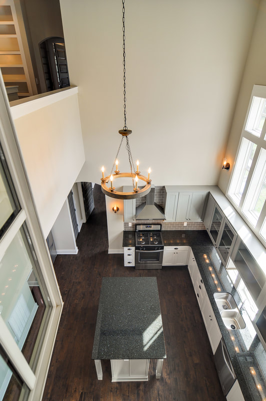 What Stands Out: 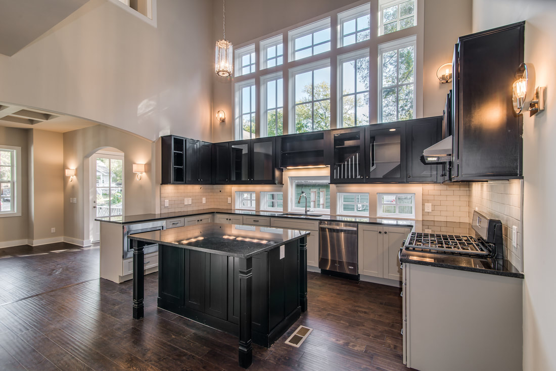 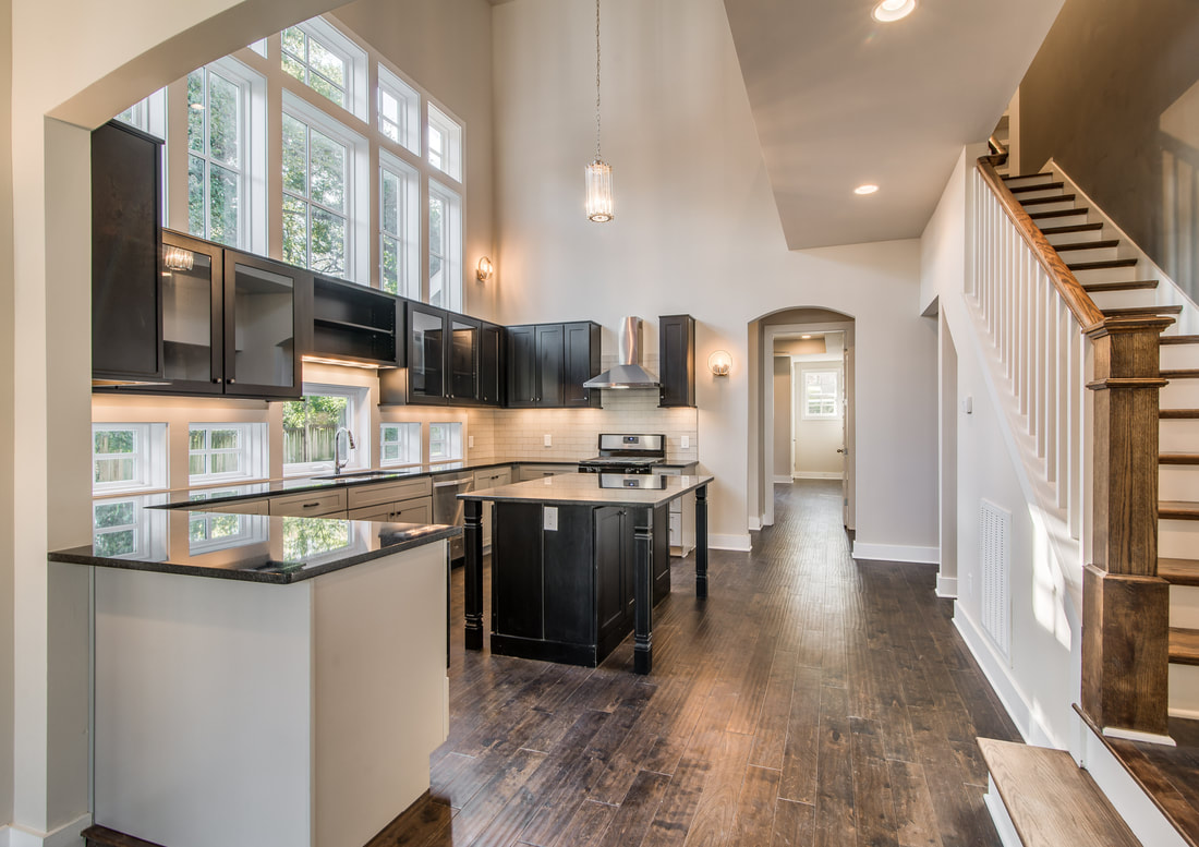 The Kitchens. We are known for our sleek and stunning kitchens---as are, really, most designers who are worth their salt---but these have especially garnered a lot of attention with their sky-high ceilings and a wall of windows. Normally you just get one window over the sink, so you can imagine that a quantity of windows like this proved expensive and caused our developer some pain. (Worth every penny.) The only thing I regret about these kitchens is that we didn’t put in even more windows. I wish they were behind the cabinets, too, so that they would have glass both in front of and behind the cabinets. 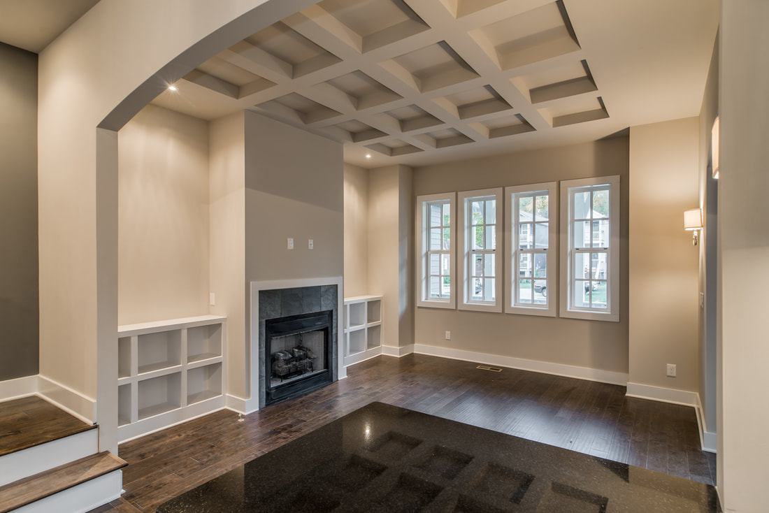 The Ceilings. Budget constraints didn't allow us to play with the ceilings as much as we would have liked to, but we were able to add beams upstairs and coffer a ceiling downstairs. Notice in the photo below that we also did a trio of skinny interior windows---another Bynum Design trademark.  Urban Outdoor Spaces: If you read our recent blog post on designing outdoor living spaces, you know we are just as into exteriors as we are interiors. Both of these houses have a "party deck" upstairs on the front of the house, and a deck and an outdoor patio on the back. 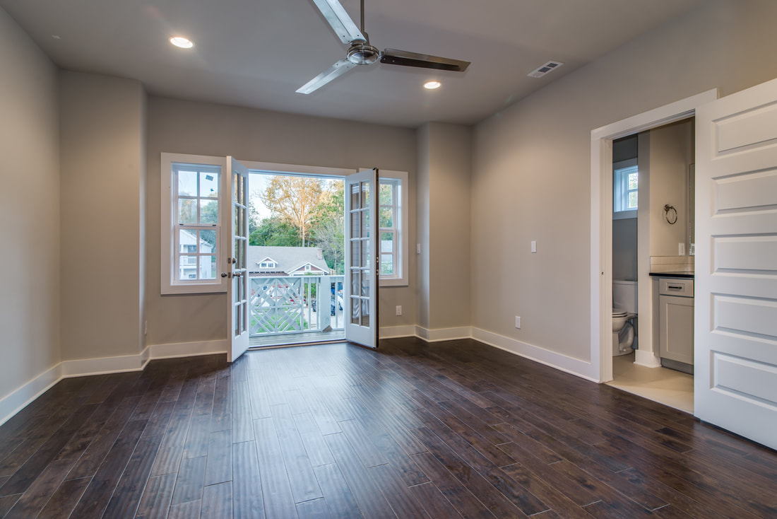 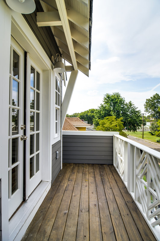 The Master Bedrooms: We were able to put double master bedrooms in each house---one upstairs and downstairs---and one of our favorite details is that the upstairs masters have coffee bars right off of them. 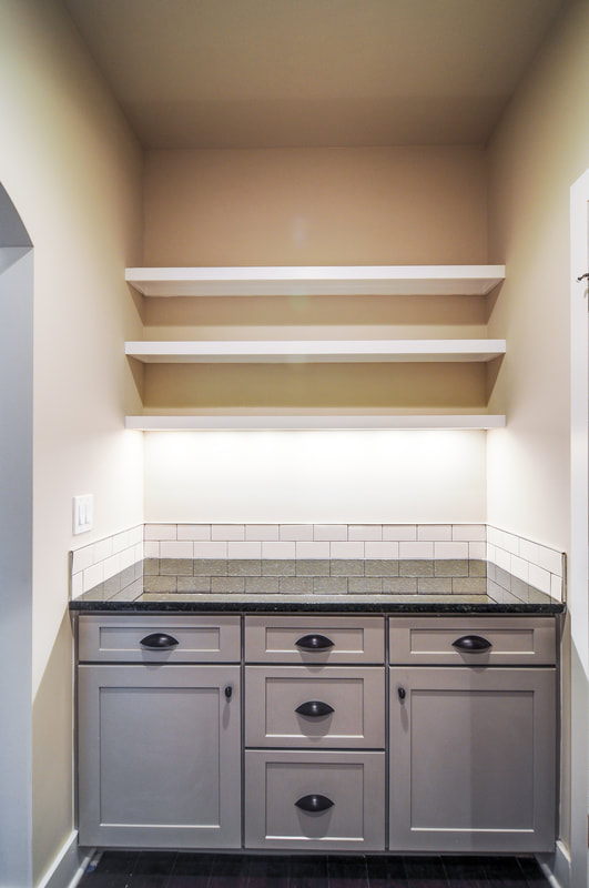 Challenges Faced: A Narrow Lot: These houses had to be narrow to fit onto a 50-foot wide lot, which meant they needed to be built side by side with a firewall separating them. We had to design around that reality but also needed to give these spaces pizzazz and personality as soon as you walked in the door. 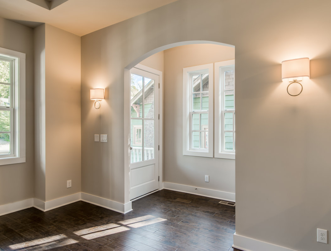 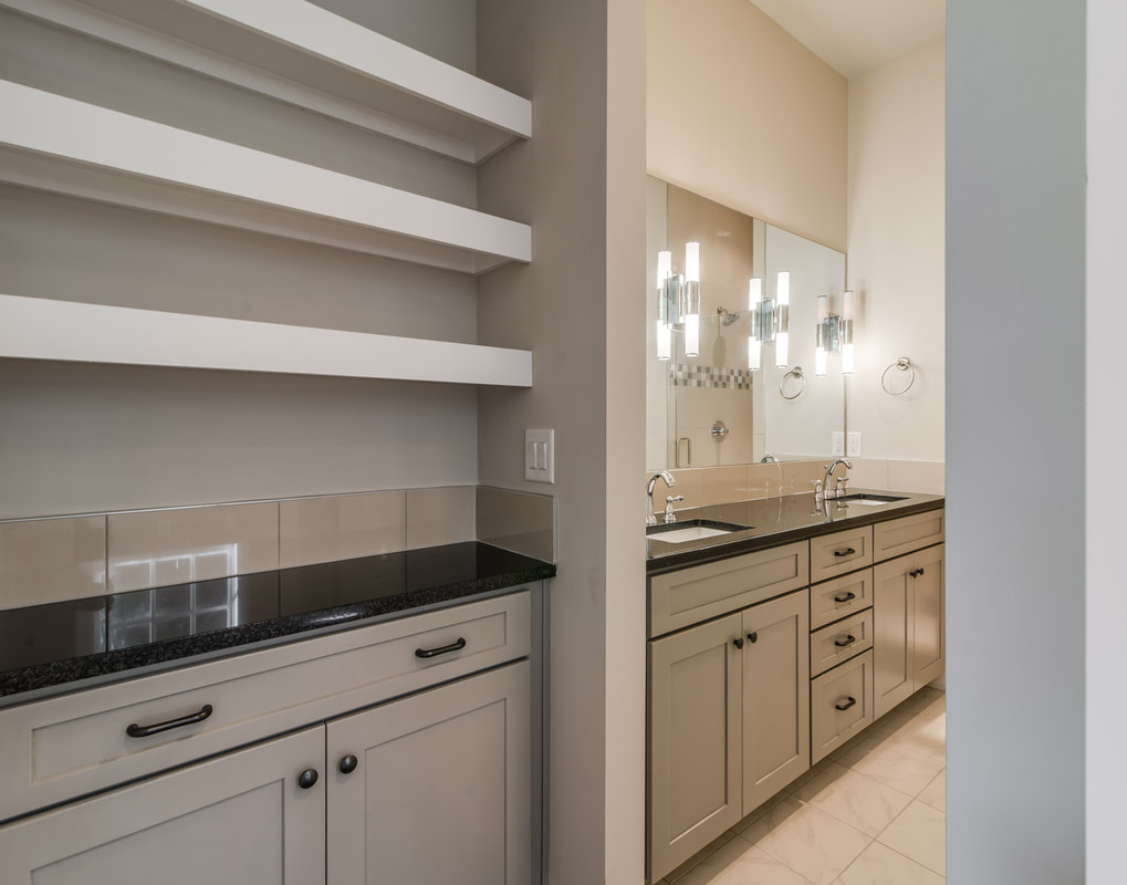 A Small Footprint: Our biggest challenge was to hit a small square footage number---we were alloted 1,895 square feet each---and yet still lend these homes a lot of our drama. When you vault the ceilings in a space, it naturally subtracts square footage from the second floor, so it creates a puzzle: How do you make the footprint big enough on the first floor so that by the time you get all of that cut out on the second floor, you’re still at your target? 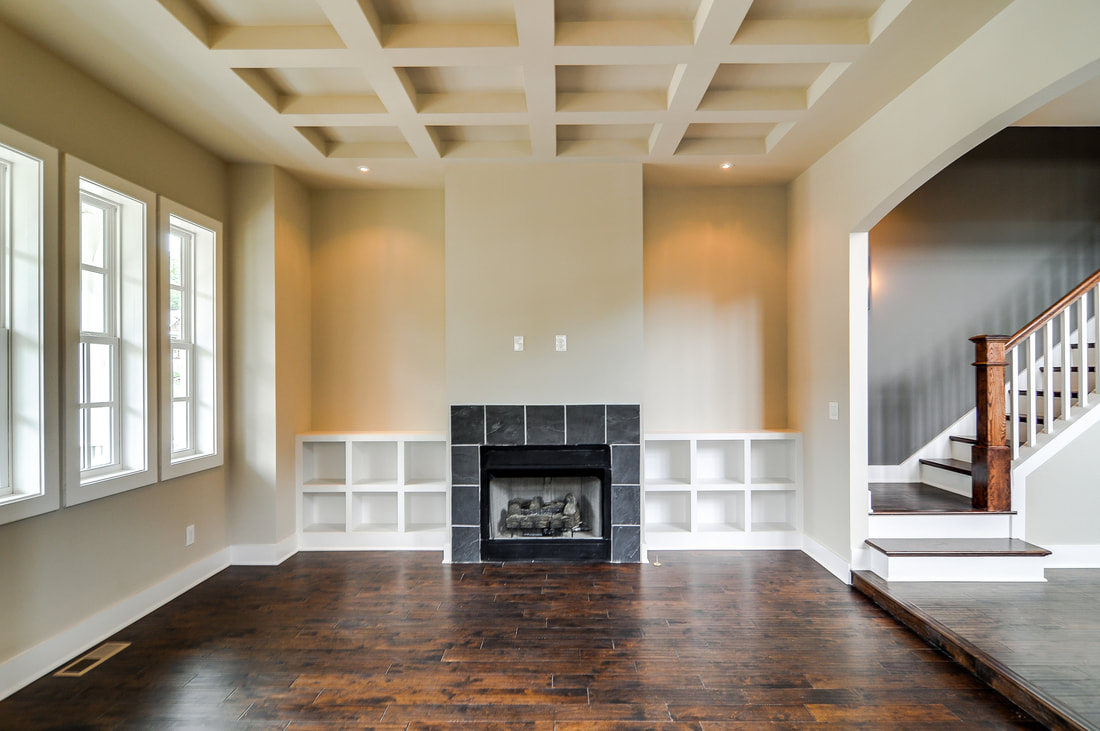 We want to know: What's your favorite thing about our Sharpe homes? Our favorite part was starting the process of getting to know East Nashville. We'll be back soon.
|
Dee BynumDee Bynum has his finger on the pulse. Whether it’s following trends, scouting emerging neighborhoods and infill opportunities, or overseeing the development of a design, Dee’s dedication to—or obsession with—his projects is renowned. Categories
All
|
|
|
|
615-415-7877
info@bynumdesign.com © COPYRIGHT 2022. ALL RIGHTS RESERVED.
|