|
I like to think that you can't tell my houses by my backsplashes. There are plenty of design trademarks that I do tend to carry from house to house, but my backsplashes have been almost all different. This is because I never get bored with dreaming up backsplashes. I think they’re a great opportunity for a home to express itself--to make a splash. Here are 13 of our favorite backsplash ideas: *The majority of these photos are from homes done by Bynum Residential Design in Nashville, but when that's not the case the photo links to the original source. 1) Slate tile backsplash. In this kitchen, we’ve taken 12X12 slate tiles, cut them into thirds, and installed them in a random pattern. 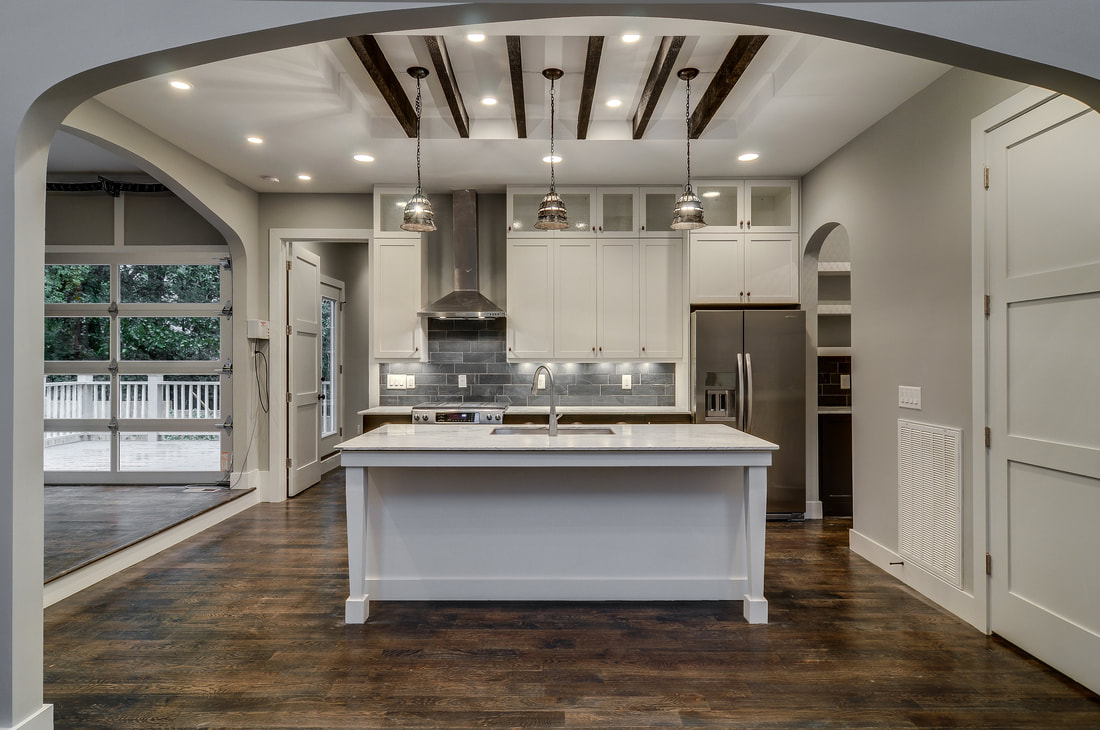 2) A chalkboard backsplash. We love the idea of putting chalkboard paint to use as a backsplash. 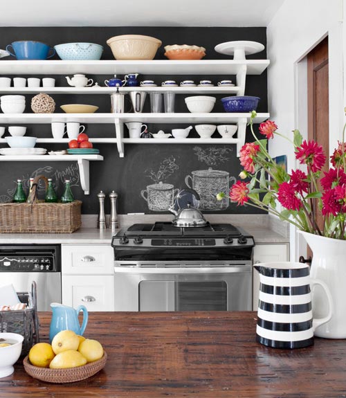 3) A beadboard backsplash. Beadboard works great, especially in a cottage-style home. If you have glass cabinet doors up top, consider extending the beadboard from the backsplash up through the back of the cabinets. 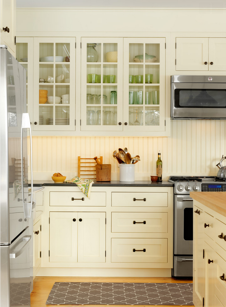 4) Backsplash of windows. Pictured here is the backsplash that we did that was all windows in the 925B Kirkwood house; it was a huge hit. 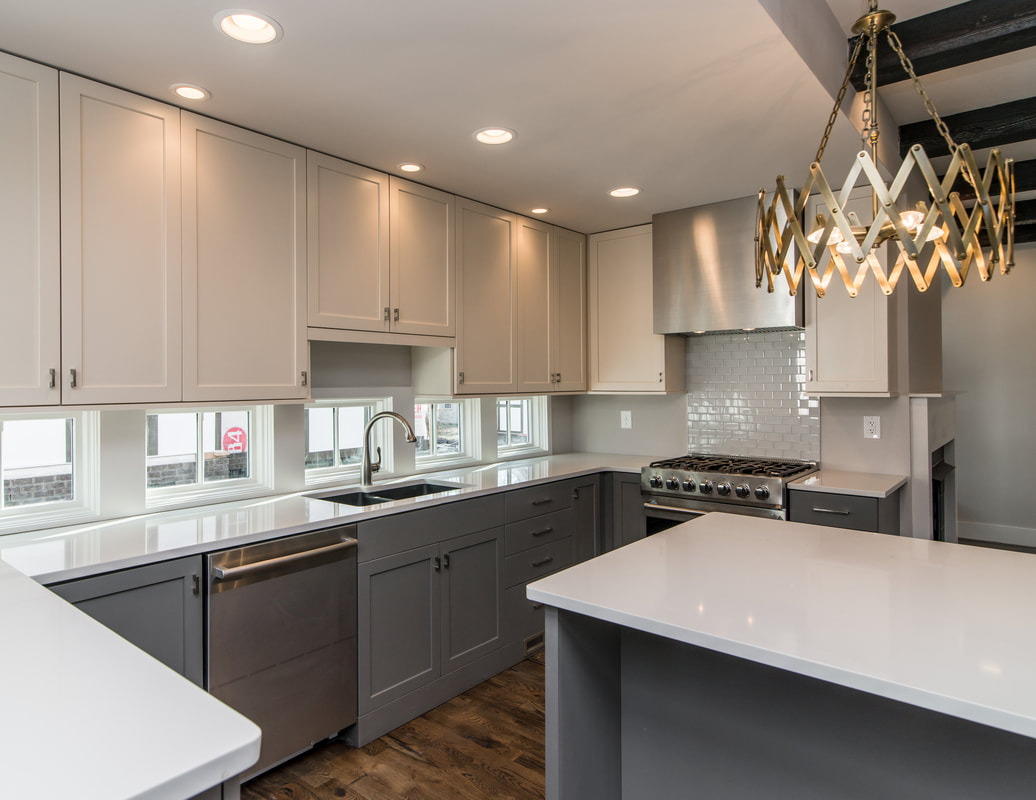 5) Glass tile backsplash. As a slightly glitzier alternative to ceramic subway tiles, I like to use glass subway tiles. 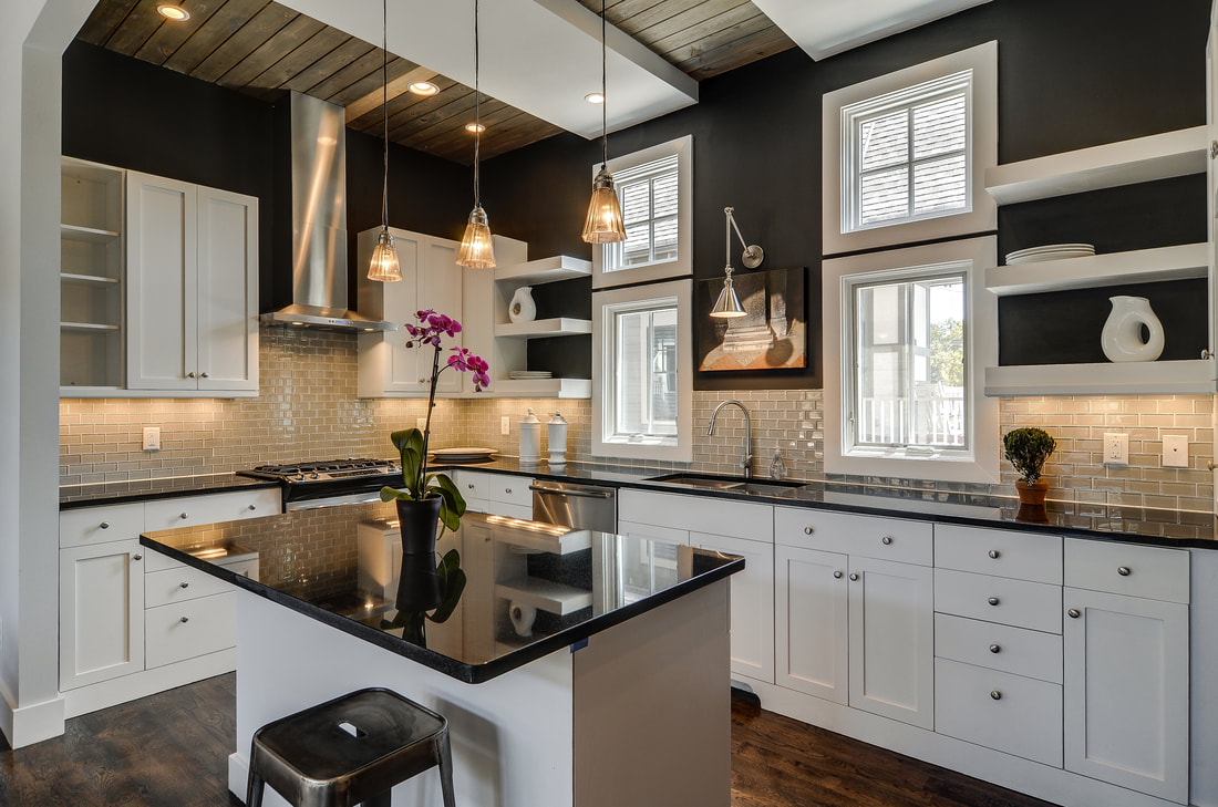 6) Backsplash of different size tiles. I often like to use glass tiles in different sizes--sometimes in a single color, sometimes using a variety of colors. We've had good luck using sheets of pre-cut tile for some of our backsplash installations.  7) Multi-material backsplash. Another favorite idea: use multi-material tiles with marble and metal and glass, all combined in a mosaic. 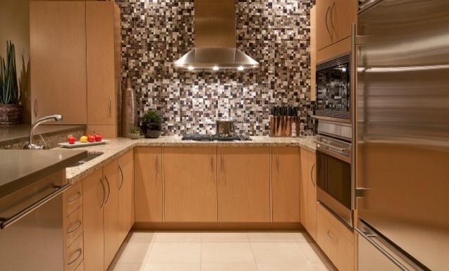 8) Stainless steel tile backsplash. We’ve also used metal tiles—subway shaped—in a kitchen, and it instantly ups the glamour--kind of like slathering the walls in shards of mirrorball. These tiles are especially beautiful with candlelight reflecting off of them. 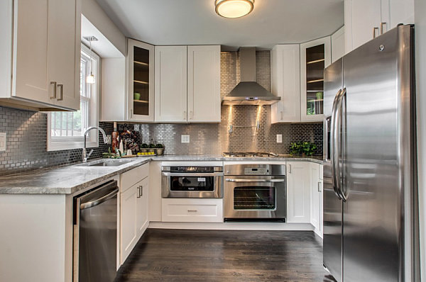 9) A tongue and groove backsplash. Tongue and groove (or shiplap) is great in a lake house, beach house, or any space where you want a more casual, country, or coastal vibe. 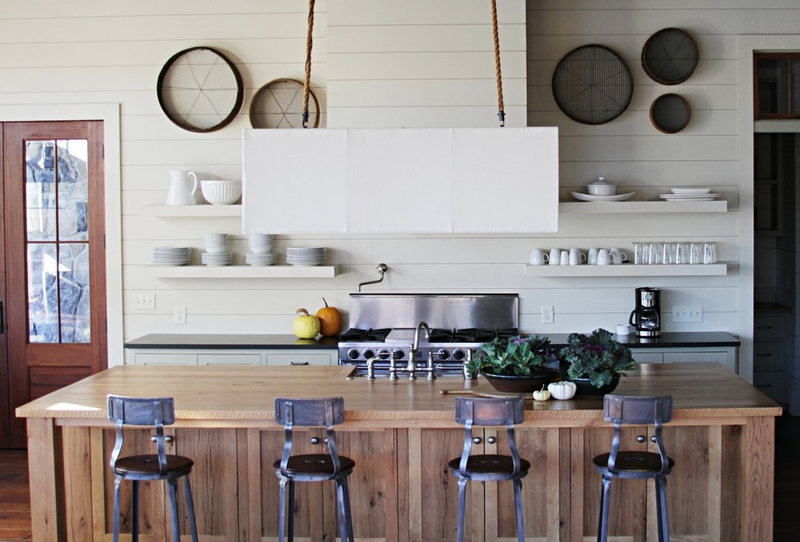 10) A mirror backsplash. A great way to add light and polish to a bar or kitchen. Antiqued mirror backsplashes are best. 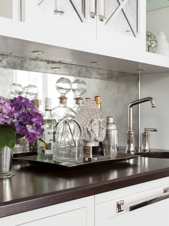 11) A stacked backsplash. Sometimes we install the tiles stacked for a more modern look. The 12South house we did on Lawrence Avenue is big format glass, which I think works great in a spacious kitchen.  12) A vertical backsplash. Consider installing brick-shaped tile vertically instead of horizontally; this would be best in a bathroom backsplash. 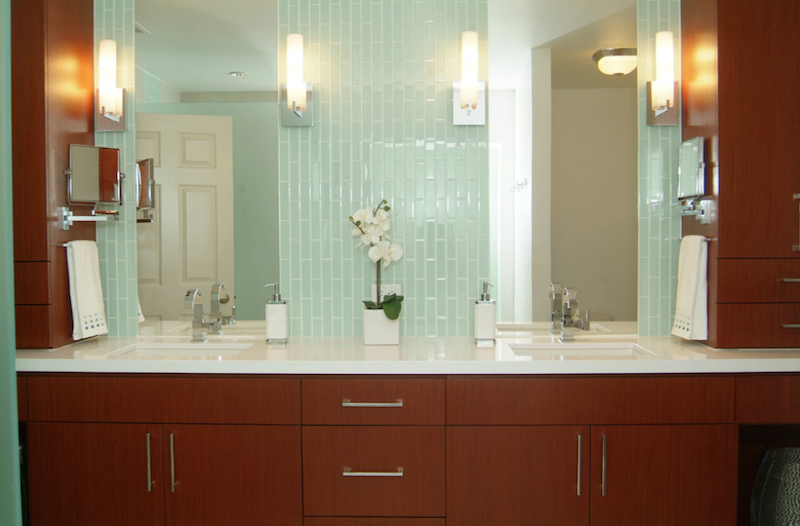 13) A mixed materials backsplash. Don't necessarily feel like you have to choose only one backsplash material. In the kitchen below we used stone tile squares, wood, and hexagon penny tile to create an eclectic backsplash. 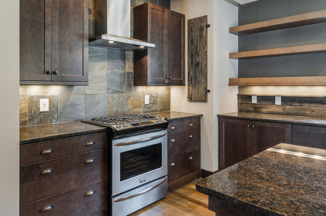 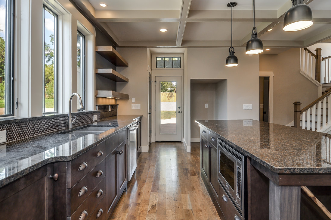 What's your favorite backsplash look?
0 Comments
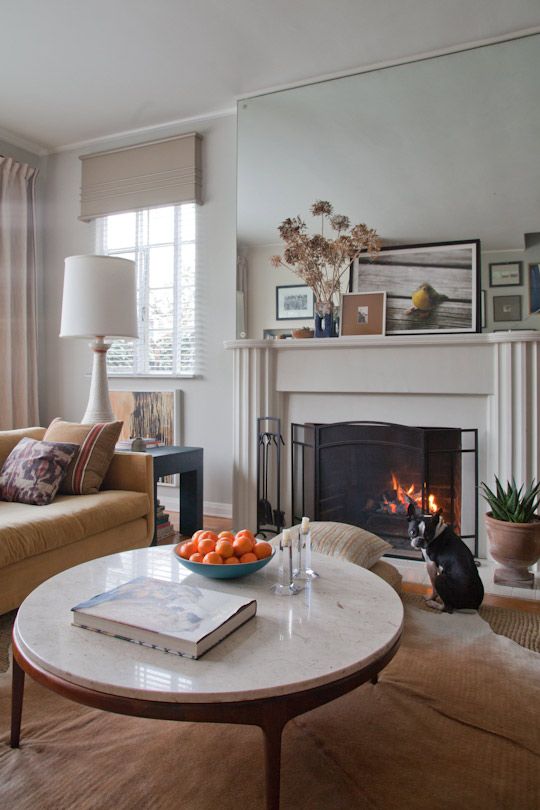
 When approaching a whole-house interior paint scheme, Bynum Residential Design likes to kick our Nashville homes up a notch by tweaking tradition and putting more than a little thought into not only our paint color choices but also the type of paint we use, how we use it, and where we slap it. Here are five ways we use paint to create extraordinary spaces. 1. Paint your walls and trim the same color. Consider painting your trim the exact same color as your walls. I've recently done this very successfully in two of our spec houses, and it does wonders to make a room feel bigger and blur the lines between spaces. In the houses that we deal in, where square footage is from 1,800 to 2,500 square feet, it just reads larger if the trim and the walls are all the same. You still do need to make the distinction between oil-based and water-based paints--painting your trim with oil paint and your walls with water-based paint. That makes the light reflect off of the surfaces differently so your trim pops a little more even though it’s the same color. I think this look is more modern even when the space is very traditional.  2. Or paint your trim darker than your walls. I sometimes will choose to use a dark trim and a light wall color; in fact that's what we did in our renovation at 903 Lawrence Avenue. Whether or not you want to do this will just depend on the vibe that you’re trying to create, but my take on it is that it's a bolder way to play with neutrals. It also nods to colonial times, when it was very common to have darker, boldly colored trim contrasting with lighter walls. And for practical reasons it just makes sense; your dirty baseboards aren't going to bother you nearly as much if they're painted dark gray. More often than not I'm going to go with a trim color that contrasts with the wall color; I talk more about my love of contrast in our 6 Best Dark Paint Colors post. 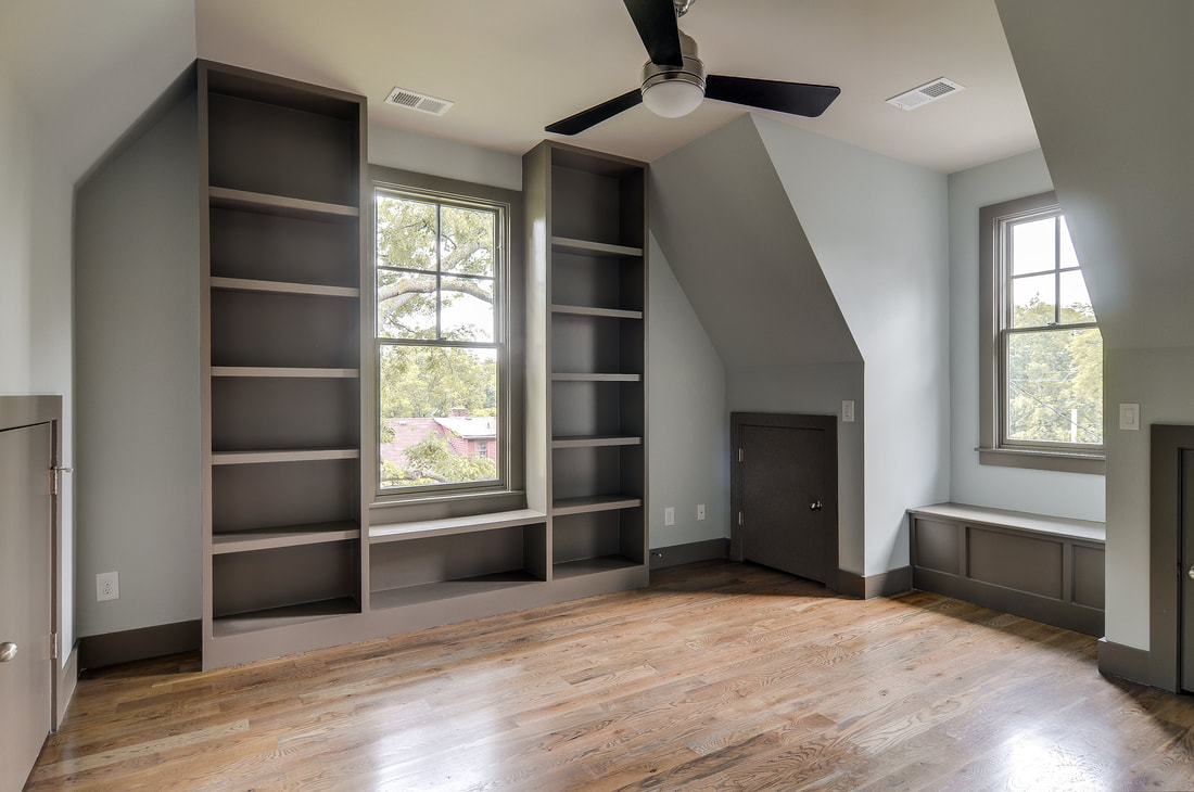 3. Paint a feature wall with oil-based paint. I follow common thought by always using oil-based paint on trim, but I like to utilize oil paint in other ways, too. For instance, if we do a wall that has a lot of paneling on it then I would paint the trim and the drywall with oil-based paint so it looks like a wood feature wall. Stairwells and chimneys (see below for example) are also great places to take advantage of oil paint's sheen, if these are areas that you want to read more importantly. And of course if you have the luxury of real wood walls, then by all means paint them with oil-based paint. 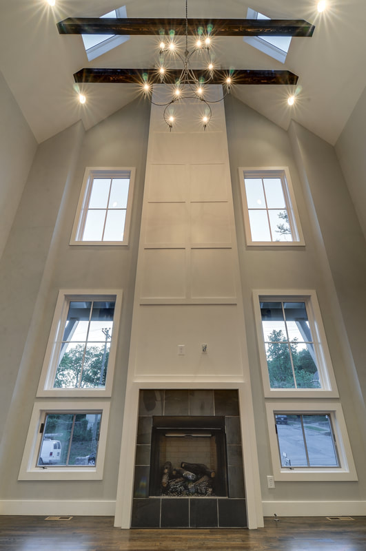 4. Paint your ceiling the same color as your walls. I love this technique in most any white room, but it also works great in a master bedroom or nursery. By using a dark color, you are better able to control light and mood and sleep. Being surrounded in the same dark hue feels like being wrapped up in a blanket. 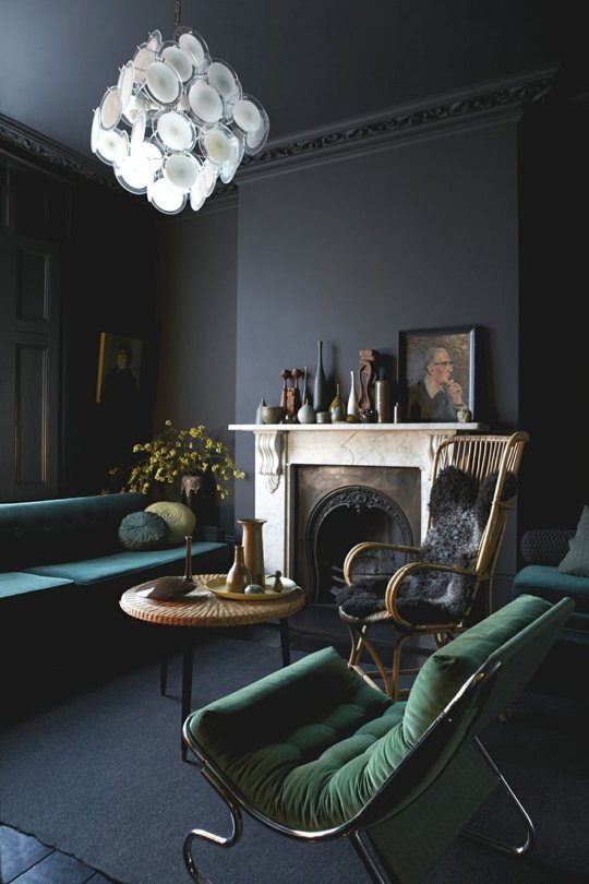 Photo Source: Apartment Therapy 5. Paint your trim the same color throughout your house but vary wall or casement colors. This final point may be a bit obvious, but we have seen people use different color trims in their home and it is almost always a blunder. Typically you want your trim and your doors to match throughout the home, whether the doors are wood or painted. This is important for unifying a house from room to room. That doesn’t mean that your cabinets have to be the same color as your trim; there's lots of room to play there. And of course you can have fun with wall color, too. We just did a house—one of the houses with the walls and trim the same color in most rooms—where in certain rooms there would be a different wall color even though the trim color continued. It was a really interesting effect.  Want more paint color advice? Here are 5 Great Gray Paint Colors.
 With Bynum Design, my eye is so often trained on the big picture--the bones of a house, the scale, the flooring and wall color. I love every bit of that, but I also enjoy breaking from the big picture to focus on smaller (but still satisfying) projects--like creating a tablescape in my home or putting together a display at D. Luxe Home, our shop at Nashville's Marathon Village. However, I'm giving the floor to D. Luxe Home co-owner Larry Wilkes for this blog post, as the tabletop is primarily his terrain. He’s the one behind the most inspired visual merchandising we do at our shop; you’ll find him constantly tweaking displays so that different items catch and hold our customers’ interest. This is no easy task in a shop that’s short on space and long on merchandise. Here Larry spills his secrets for creating pitch-perfect tabletops in your own home. I was born into retail and visual merchandising. My family has been in some form of retail my entire life. It’s amazing to me how many people want to open a store and think, “I’m just going to go to market, buy pretty things, put them in my store, and sell them.” It doesn't work that way. A visual display requires thought and time. It has to tell a cohesive story. It has to grab your attention, but then it also has to hold your attention, provoke you. Every item in a vignette needs to speak to the other; you can’t just pitch everything into a case, stack it up, or lay it on a table, like at a grocery store. Things have to be positioned in such a way that you're drawn in. Much of this is about trial and error and imagination. I'm always changing things around. Below I'm sharing some of my tricks for busting out of the tabletop blahs, but please don't take any of my advice too seriously. Above all, have fun with your spaces, always.  Use contrasts. A great display has to have contrasts—high and low, positive and negative, light and dark, shiny and dull. Instead of just making a grouping of crystal candlesticks, include, for instance, a crusty wood corbel right alongside that glam crystal candlestick. Or stack books to create height but then ground the table with stubby votives and a framed photo. Which brings us to... 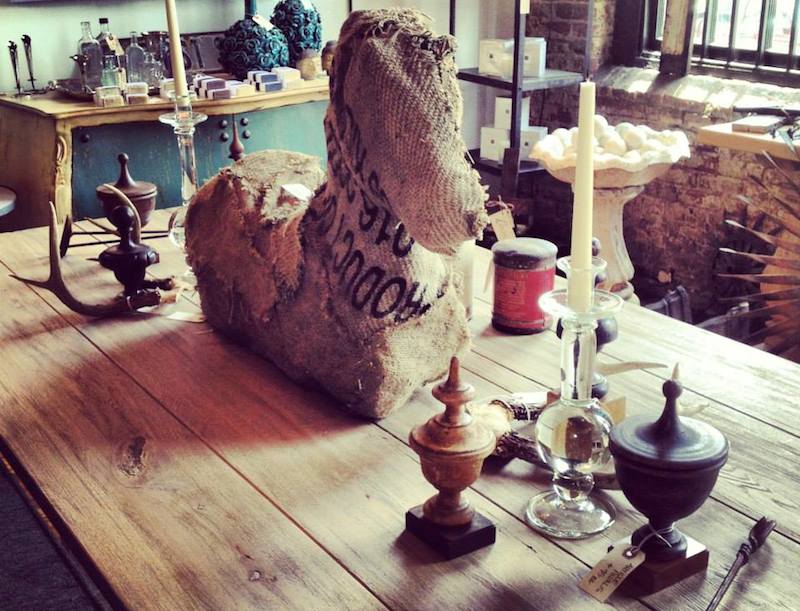 Think dimensionally. If everything on your table is the same height, it’s not going to provoke much interest, and the eye will likely skim over the whole display. In the shop we use various things as risers (cake plates, for instance) so that nothing feels flat. Spaces—tabletops included—are far more interesting when there are highs and lows. That said, if you don't feel confident creating a layered arrangement, you can always just rely on symmetry—say, two tall items and two short items—to keep things simple. Symmetry always works. 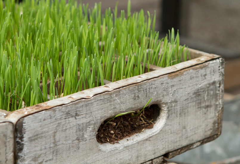 Break with tradition. The typical tabletop is so traditional and so boring. Every market I go to, I see dining room table displays overdecorated to death with chargers and plates and platters and candlesticks. I don’t like a typical tabletop. I don’t like anything traditional. Instead I keep it simple and adorn a dining table with candles, a mirror laid flat like a tray, or something really cool and crusty, like the balusters we have at D. Luxe Home that have many layers of paint chipping off. I like to use unexpected items (see the burlap horse above) in unexpected ways. For instance, we've been known to repurpose antique brackets as bookends and to create groupings of old architectural elements like corbels and balusters. Small, unique collections are always good--think a display of antique paintbrushes or of vintage baby doll heads. Don't be afraid to go kooky, as long as it speaks to your interests and vibe. Another idea: Make a departure from fresh flowers and instead center a long tray of bright green wheatgrass on your table. 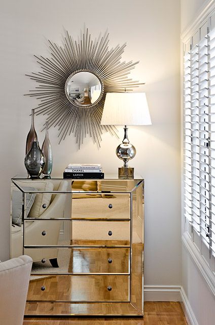 … And fall back on old faithfuls. There are certain accessories that look classic and great most anywhere you put them. It always works to stack books with candles and a lamp. You also can never go wrong with crystal candlesticks and fresh flowers. 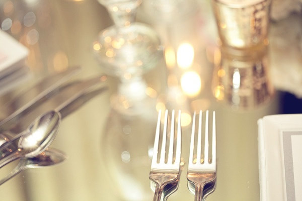 Consider the tabletop itself. When talking tabletop, it's worth mentioning that the tabletop itself can be an important part of the vignette. I'm thinking of a mirrored dining table in my home that has a rope-like pattern etched into the backside of the mirror. Because it's reflective, you don’t have to put a lot of things on it. (I love mirrored furniture, but it's important to keep in mind that a little mirror goes a long way. You can’t use a mirrored chest and two mirrored bedside tables; that’s overkill.) We have a mirror-topped table in the shop, too, that imparts a Hollywood vibe and throws shards of light around when you put crystal candlesticks or anything shiny on top of it. 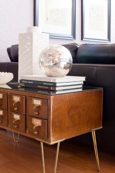 Break out the books. Whatever you do, just don’t stand all of your books straight up. You group some together, you stack some on their side, you put stuff on some. It's like a puzzle. You just keep playing with it until it’s right.
Do you have any tricks for a beautiful table display? We're always looking for new ideas. |
Dee BynumDee Bynum has his finger on the pulse. Whether it’s following trends, scouting emerging neighborhoods and infill opportunities, or overseeing the development of a design, Dee’s dedication to—or obsession with—his projects is renowned. Categories
All
|
|
|
|
615-415-7877
info@bynumdesign.com © COPYRIGHT 2022. ALL RIGHTS RESERVED.
|