|
A few months ago I visited South Africa, which I can truly say was life-changing—and not just because I lost my wallet in the gift shop at the airport while buying design magazines. I have a few words on the subject, but mostly I have lots and lots of photos to share.  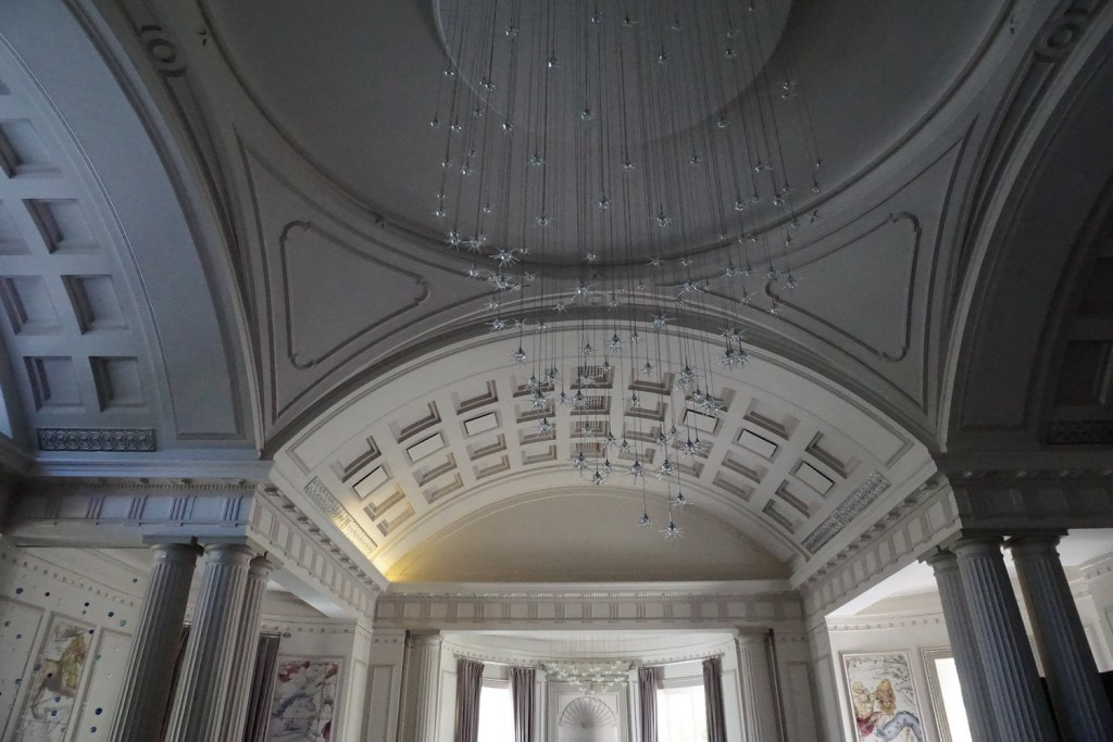 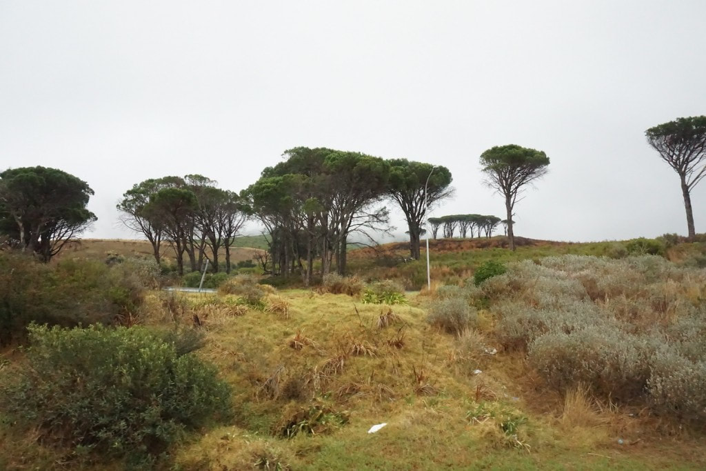 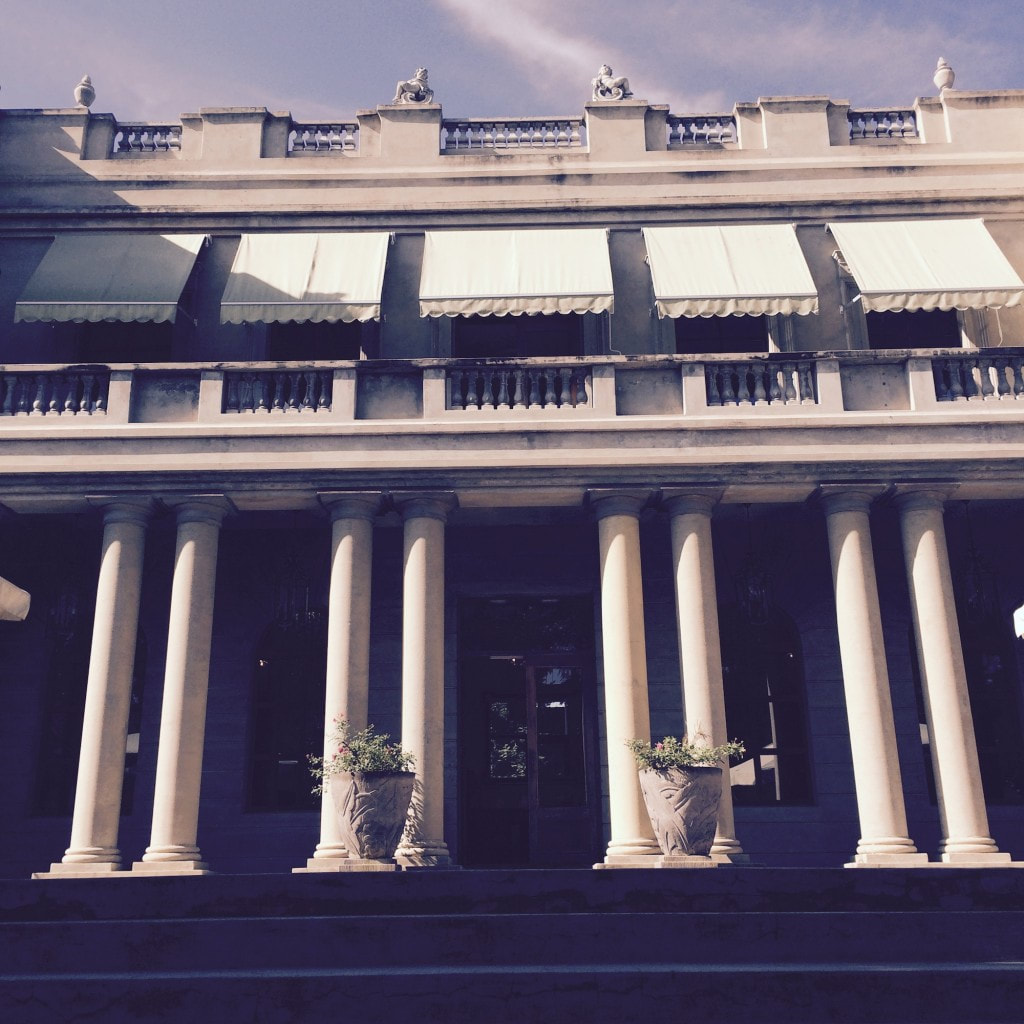 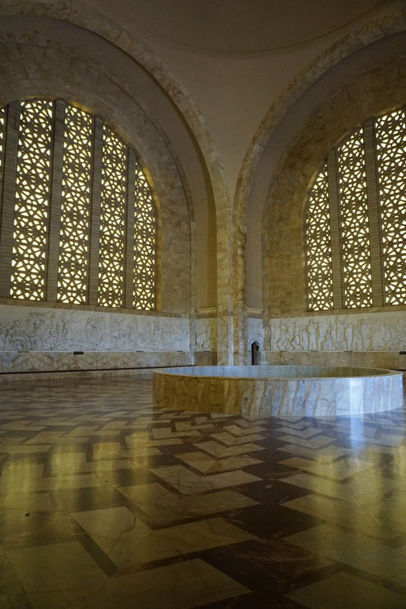  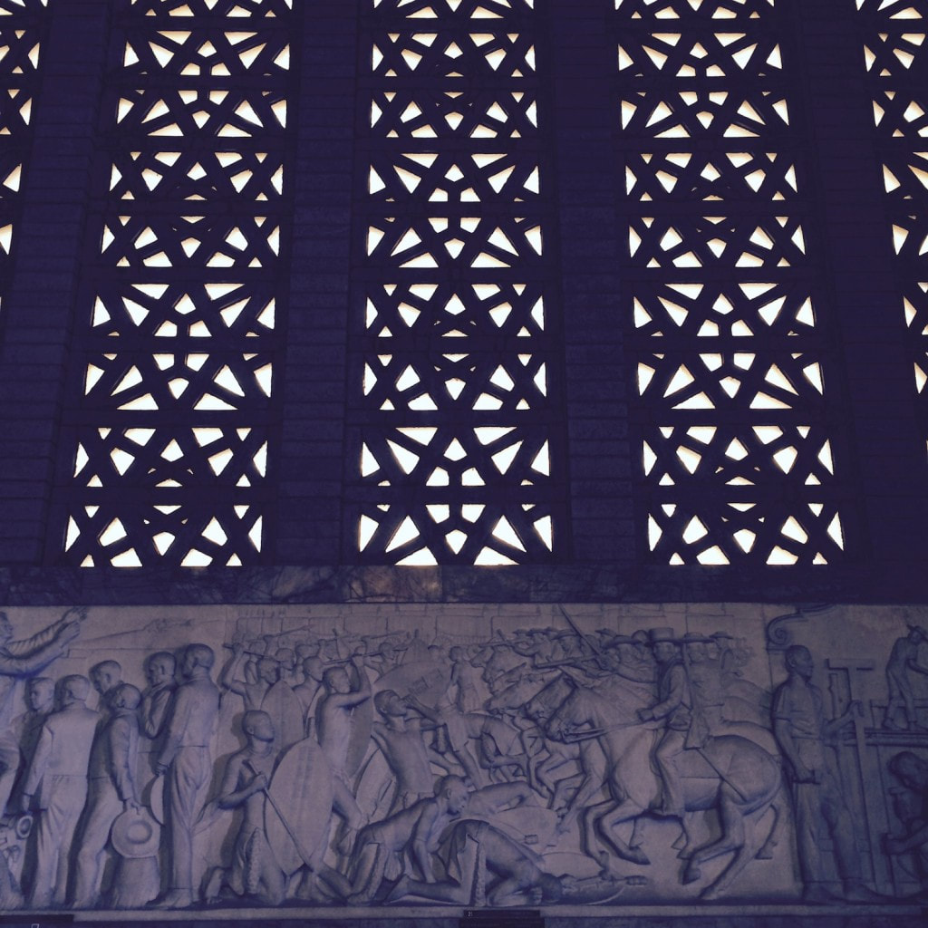 Our travels took us to Johannesburg, Pretoria, Cape Town, and a few other, smaller cities. As a designer, and a human, I’m really lucky that I get to travel as much as I do and to spend so much time in hotels as I do because you come across some of the most incredible design in hotels and get to fake-live in these beautiful environments. Some of the hotels we stayed in in Africa were just magnificent. And almost everywhere we went, there were all these things that harkened back to the English and to Dutch colonialism; so the architecture kind of looked like Rosemary Beach everywhere—except it was real. 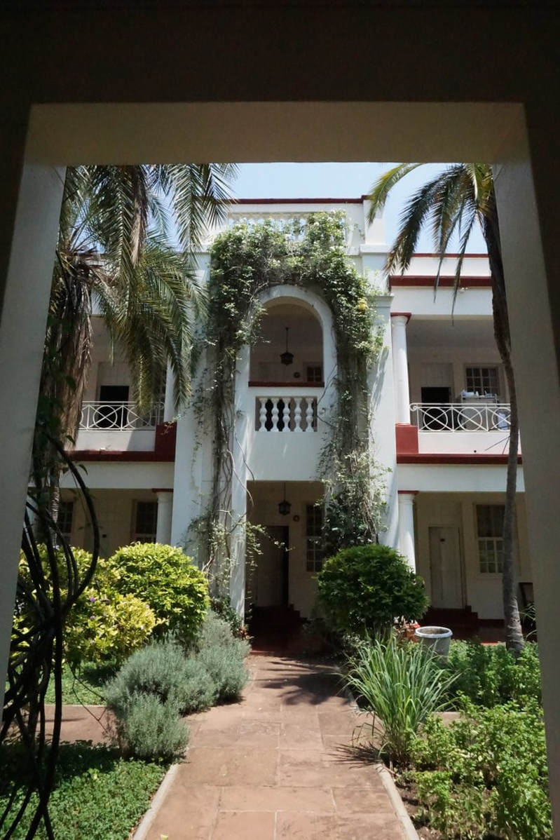   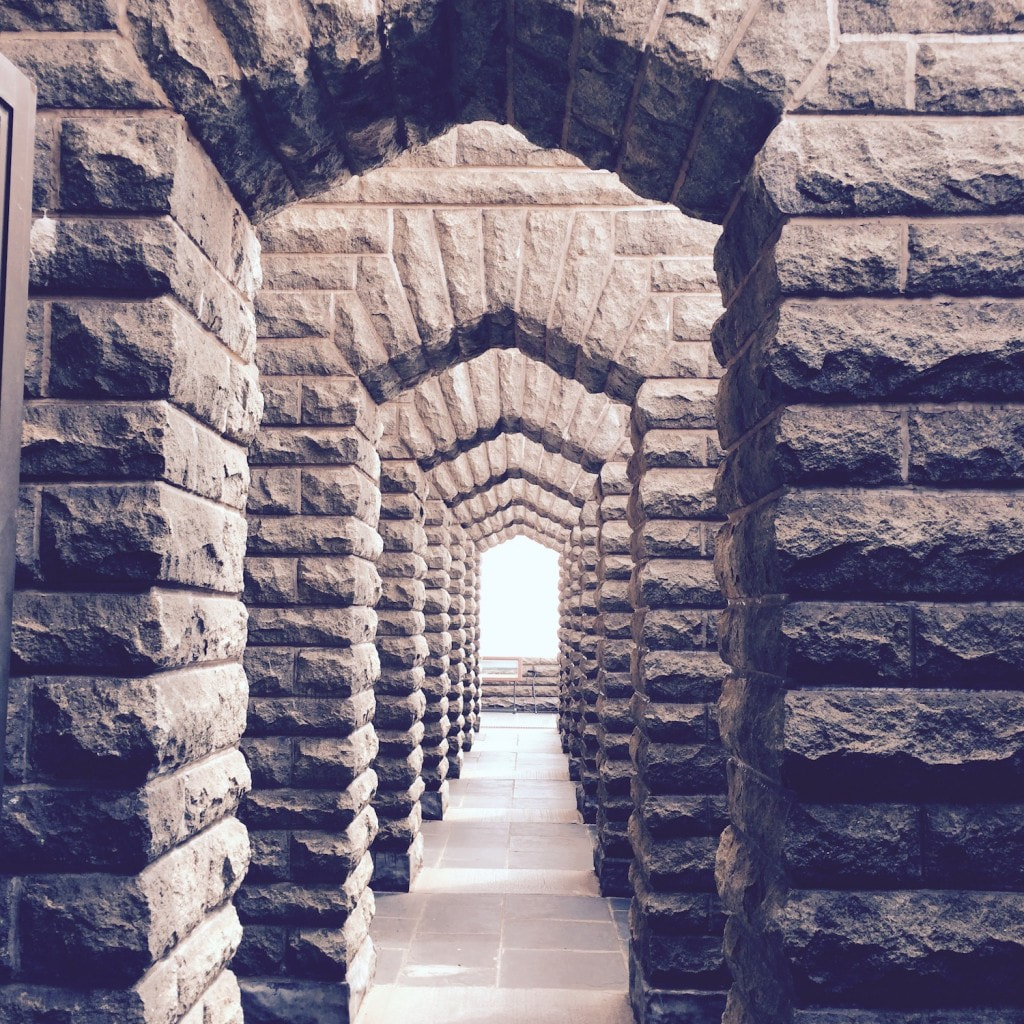 There were houses that were these bright pinks that fit right in there, which goes against my rule about light and color and distance from the equator. (South Africa is opposite the equator, and I ordinarily tell people that the closer a place is to the equator the brighter the light is, which is why you see all those colorful exteriors in the Caribbean that look fantastic. In Nashville, if you try to do a bright, beachy exterior, it most of the time looks really tragic because the light’s not right.) 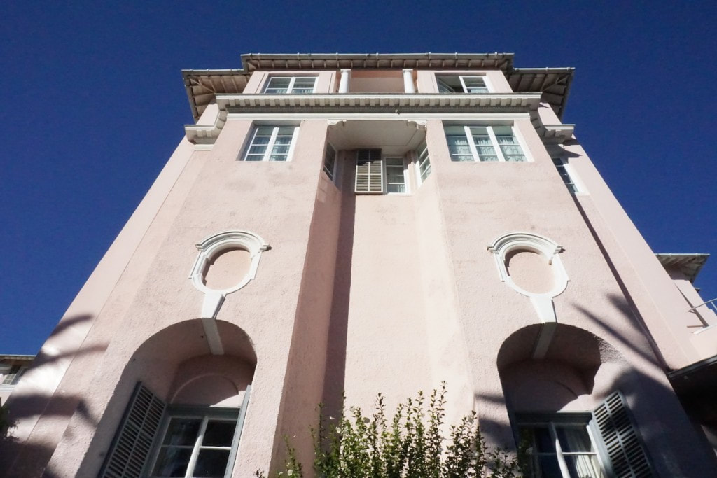  On the other hand, I also didn’t expect to see so much wonderful, wonderful modern architecture in Africa, especially in Cape Town. It was kind of shocking. You have an impression of what some place is going to be, and then when you get there it’s never what you thought. Thankfully. 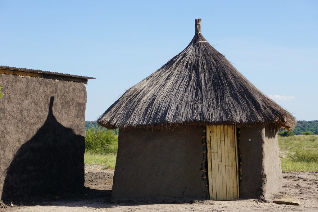 I thought Africa was going to be mud huts, and we did see some of that, too. We went to this one village, and it was sort of a tourist village. (You know that’s where they take everybody.) But their huts really were made of mud and straw, and it was so amazing to see that up close and to see how effective these houses are. It’s hard to imagine that people live like that, but they don’t know what they don’t have, and they’re probably much happier than we are. One of the huts we saw had an entertainment center and a gigantic TV, and there was a curtain that separated it from the bedroom and it was like, Where am I?! I guess he was the chief of the village or something. I didn’t see any satellite dishes anywhere; I don’t know how he got this TV. Maybe he just got a TV somewhere and propped it up on his entertainment center? I don’t know. 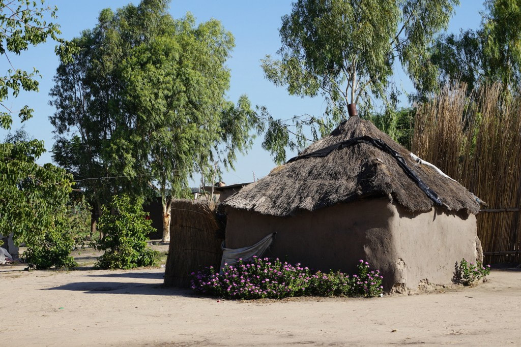 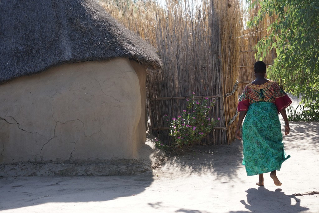 My one disappointment about Africa is that I wish we’d gone to somewhere more authentic. I wanted to see topless women. I wanted National Geographic. I wanted real and raw. Lip plates and neck rings. But I guess that’s in a different part of Africa, and you probably take your life in your own hands going to those places. I want to close this post in Johannesburg, where we stayed at a place called Fairlawns Boutique Hotel & Spa. This was full-on glam. It was sort of new, but it looked very old. It wasn’t the architecture that inspired me really, but how they put furniture together. They had all these wonderful, dark-wood African antiques next to these Lucite cube tables. The way they married these styles was really sophisticated. I’ve seen all that stuff married together before, but the way they did it and in this totally white room with all this dark furniture and so much detail, it just did it to me in a way that I’ve never experienced before. Even the duvet cover mesmerized me, and in the dining room the tablecloth was this texture I’d never seen in fabric before. It was the most gorgeous thing, and it was just a simple little subtle detail. 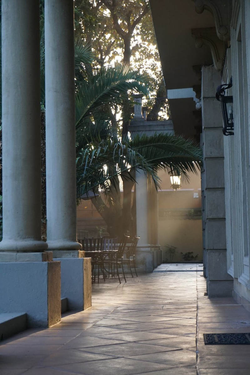 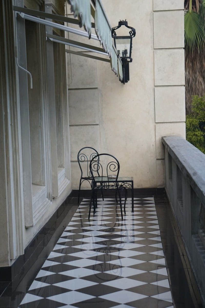 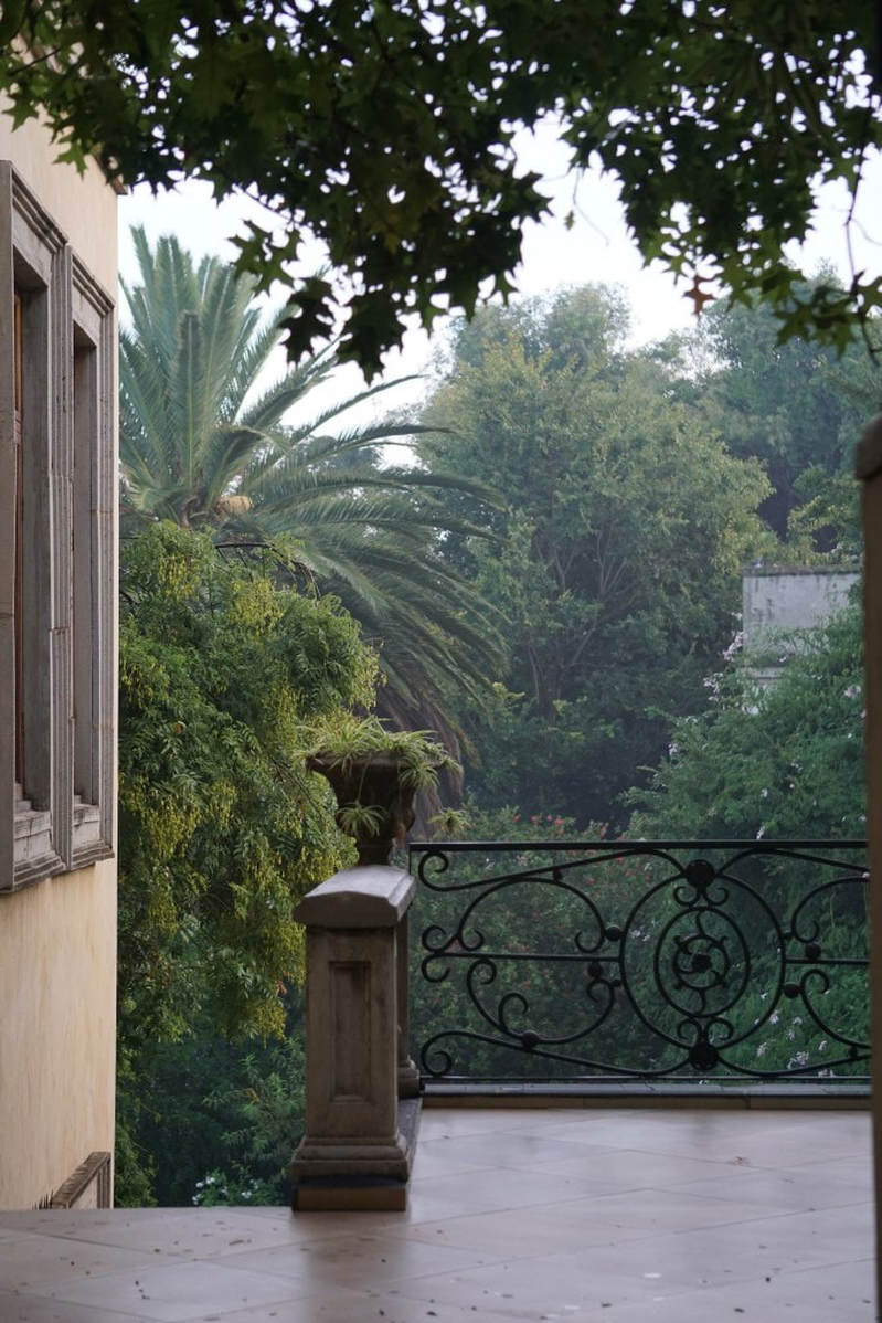 The thing that got me about South Africa was in my head. It wasn’t like I saw a field of grass and decided to go green or anything like that. It was more of a real, emotional response to just being there. It was overwhelming. I don’t know if it was because I was in a part of the world I’d never been before or if it was because of what I was seeing or the people I was meeting. Their accent was amazing, and they were so warm. I can't explain it; I hope my pictures help. 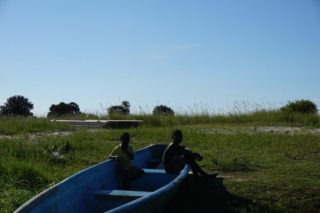  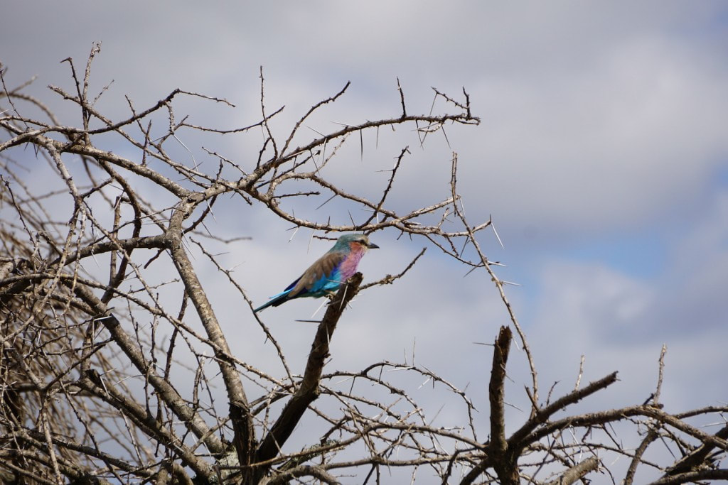 Stay tuned for a post about our trip to Italy, too!
1 Comment
When we were asked to be one of a handful of Nashville interior design teams to stage one of the new Twelve Twelve condos in the Gulch, the builders wanted our help amping up the design drama to help these things sell. 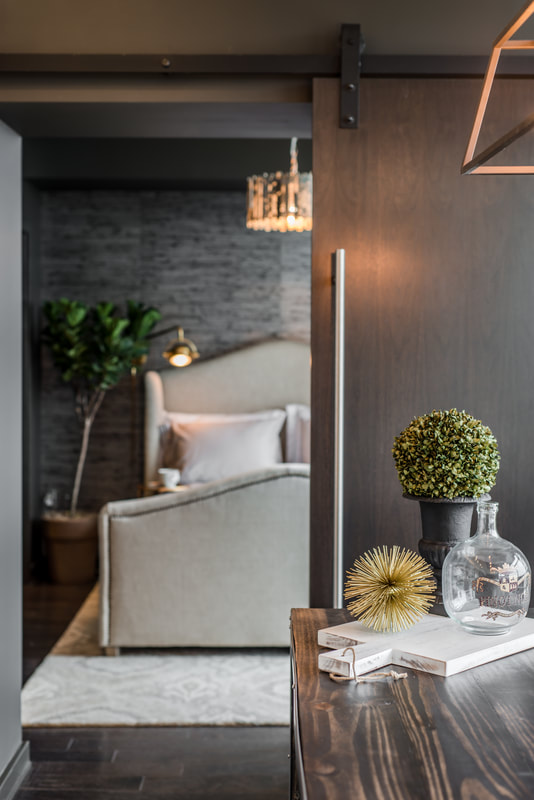 It’s worked, as Twelve Twelve is forecasted to be sold out by year’s end. So while we’re happy that we accomplished what we were asked to do, we’re mostly happy that we have this gorgeous space to show for it. And we're grateful to have had photographers StudiObuell to capture it. 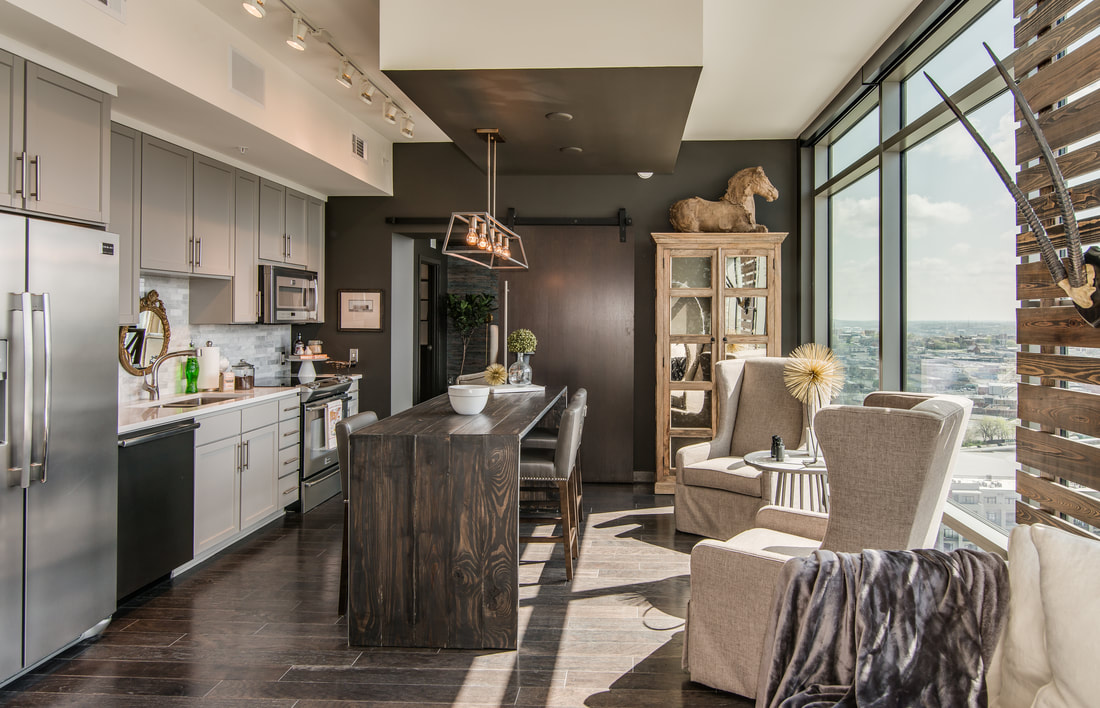 A couple of months back, we shared our inspiration boards with you. Now, here’s the real deal: 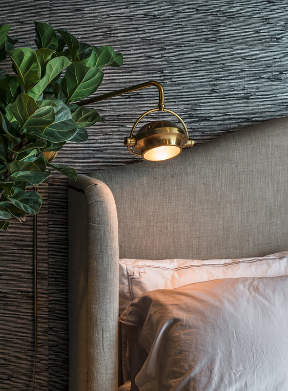 It ended up being liberating to not have much square footage to work with (we had two bedrooms, the tiniest of which we repurposed into a Music City-appropriate music room, and two bathrooms). And of course it was helpful that they didn’t just hand us the keys to the castle; they handed us the castle and let us go for it. There were a few things already done, but for the most part we got to select everything from the unit itself to the finish scheme. 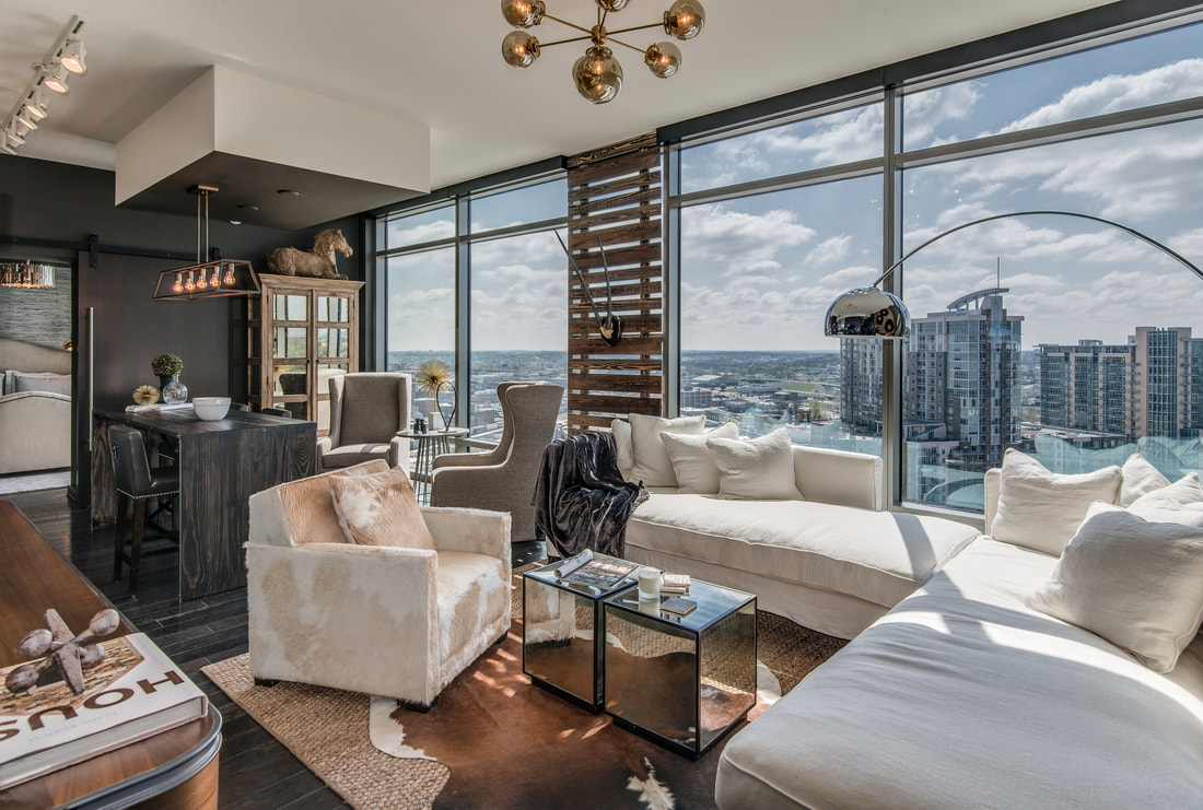 We were even able to choose a Sonos music system and the TVs. We picked out the rolling window shades, paint colors, and of course all of the furniture and accessories. If you’re curious about any of the above, we sourced most of it from our shop, D. Luxe Home (and we’ve dedicated a separate blog post detailing where everything came from). This project was very much a group effort—with insights and ideas coming from those on-staff at Bynum Design as well as from the fabulous Sally Kyle. 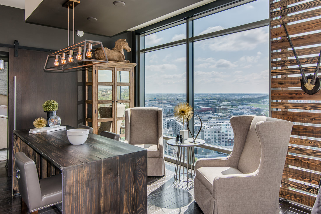 We knew from the get-go that it was sophistication we were after. But my overall approach was, at the end of the day, to create a unit where I would want to live. (Speaking of the end of the day, it’s especially sexy up there at night.) Mission accomplished; I could move right in. Had I bought this unit, I would have probably done exactly what we did to it. 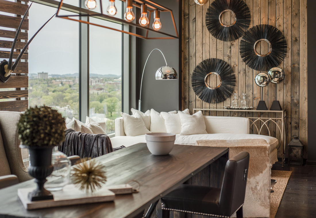 I think the biggest ah-ha! moment for us in tackling this space was to do the opposite of what most people do when designing a high-rise unit—that is, to center everything around the view. We came to understand that while the view is important—and dazzling—it’s not everything, and we don’t want to be facing it the entire time, so we placed a lot of furniture against the window wall and created several zones in the one main room. Creating a cozy, flexible space was what was most important. 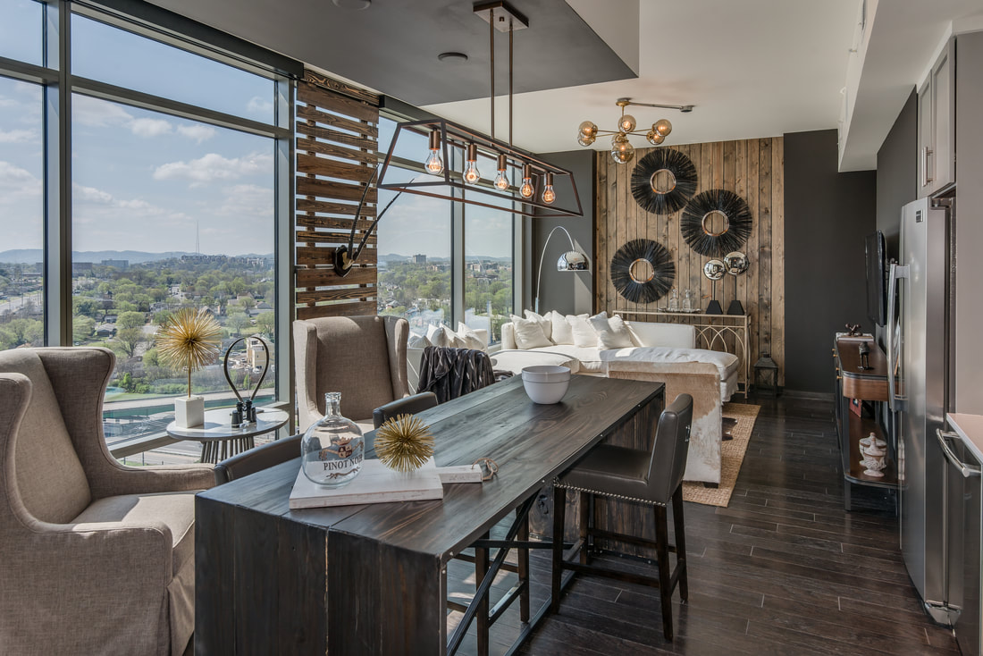 We even moved the original location of the TV from the wall they had it on to an inward wall because we wanted you to be looking in, not out. We created a space to watch TV ... 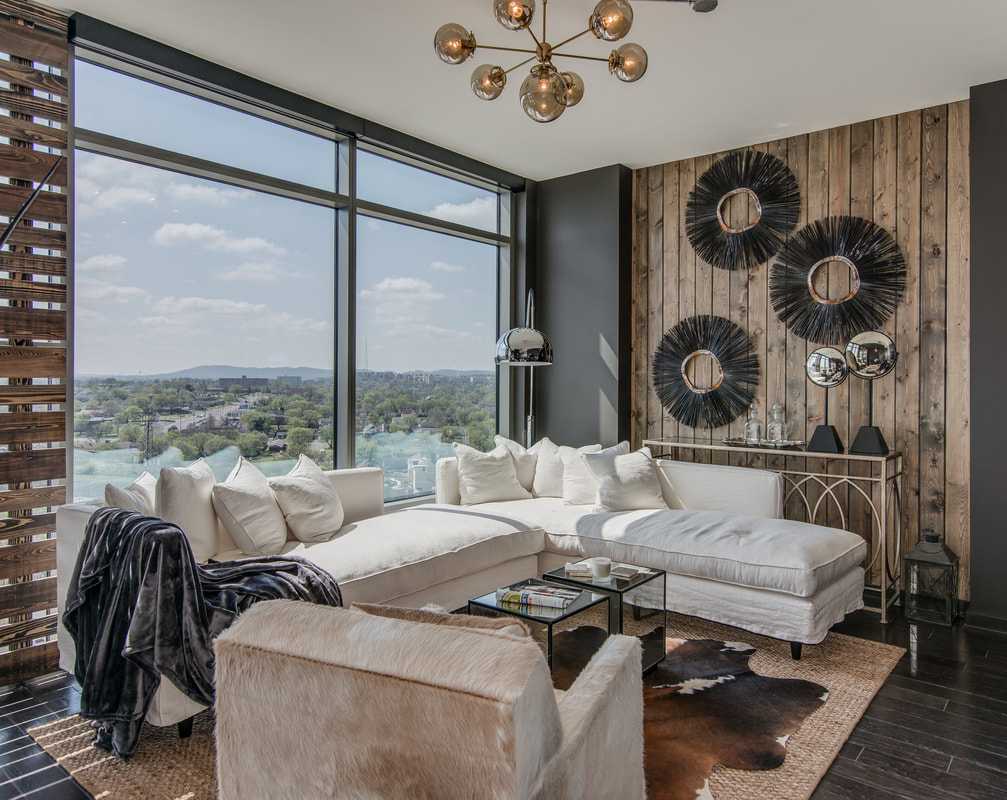 We created a space to eat... 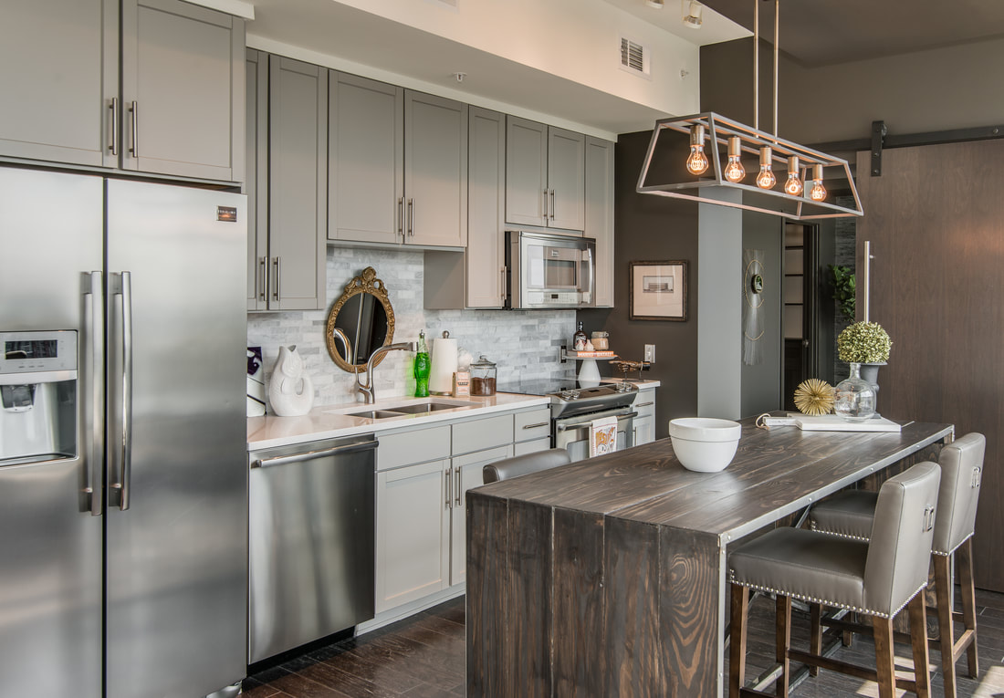 ... and then we created a separate space with these fab swivel chairs. You can be in one and talking to whoever’s cooking or looking out at THAT VIEW. It is just perfect. 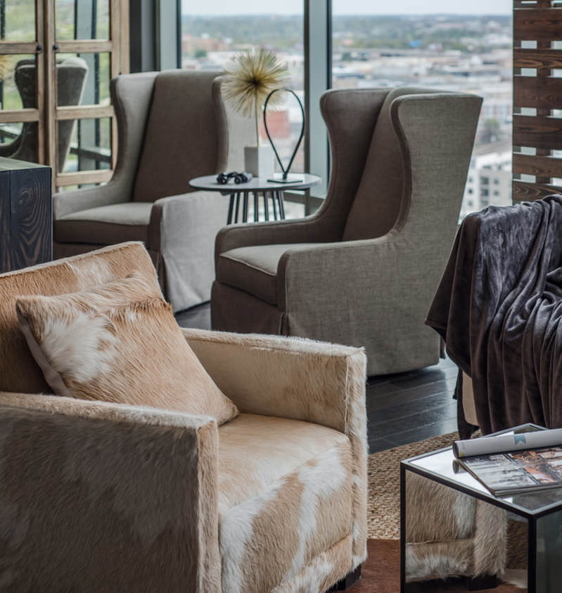 Our other prevailing way of thinking about this project was to bring details from the exterior of the building and reference them in our design. For instance, we identified a detail on the building that we really liked above the freight dock; there’s a giant, three-story wall of wood slats, all different widths. At one pint, when we were feeling like the space was just so long and needed to be broken up a bit, we looked to the narrow mullion in the center of the windows and decided that was the prefect place to take that wood slat element and introduce it into the interior. We had this made by a carpenter who specializes in high-rises; who knew that was a specialty?! It turns out that the fact that everything that goes in and out of a high-rise building has to fit inside an elevator requires some extra creative thinking.  There was another room—technically a guest bedroom—that didn’t have a door on it. (Since it’s in Nashville we wanted to give the condo a music theme, so we envisioned the second bedroom as a music studio where you would write and play guitar. We’ve got little music motifs everywhere in this condo.) For the music room, we had another one of these wood-slat "thingies" made and hung it on a barn door track. You can see through it, but it gives you the feeling of privacy, and it adds texture in a space that really didn’t have any texture. 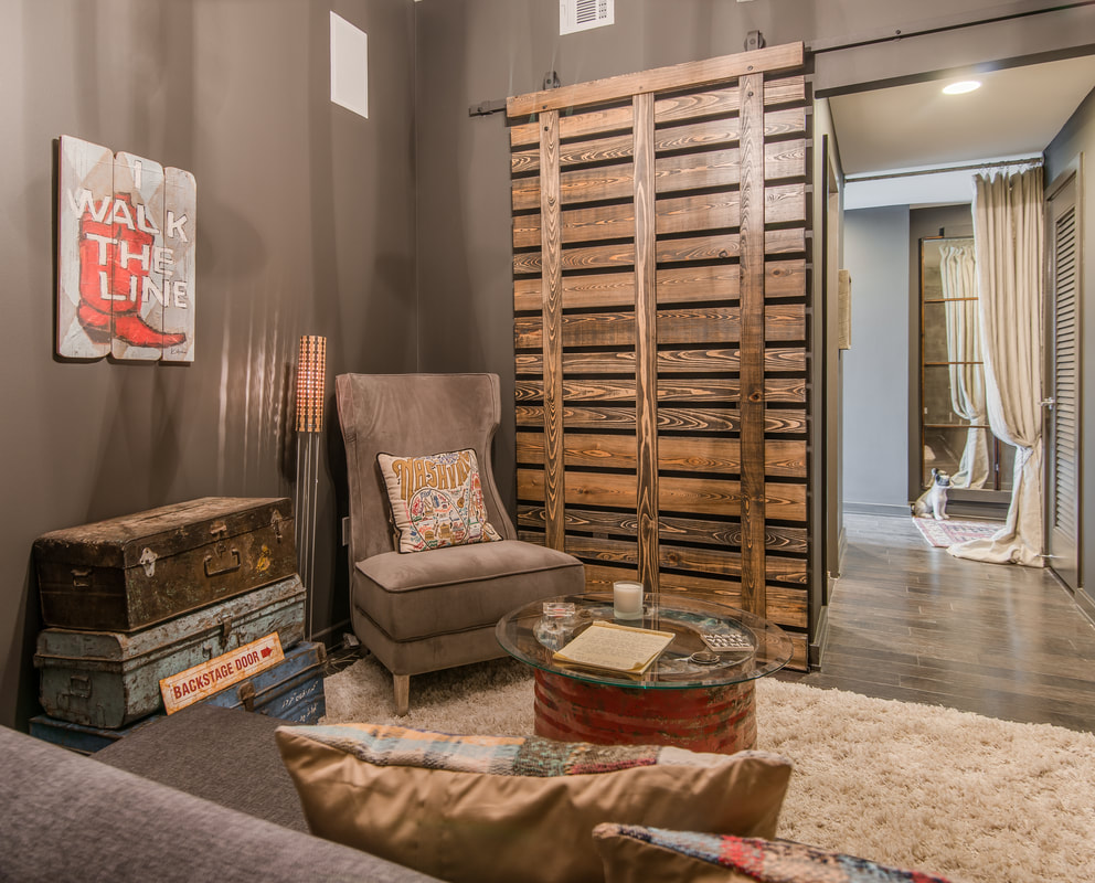 Another challenge we faced is that this unit didn’t yet have an island or a kitchen table, but it did have soffit on the ceiling that designated where the island was supposed to go, even though we didn’t want to put our island there. We ended up moving the lighting away from where it was originally supposed to be to tighten up the kitchen work area and to give us space to do the thing with the swivel chairs. 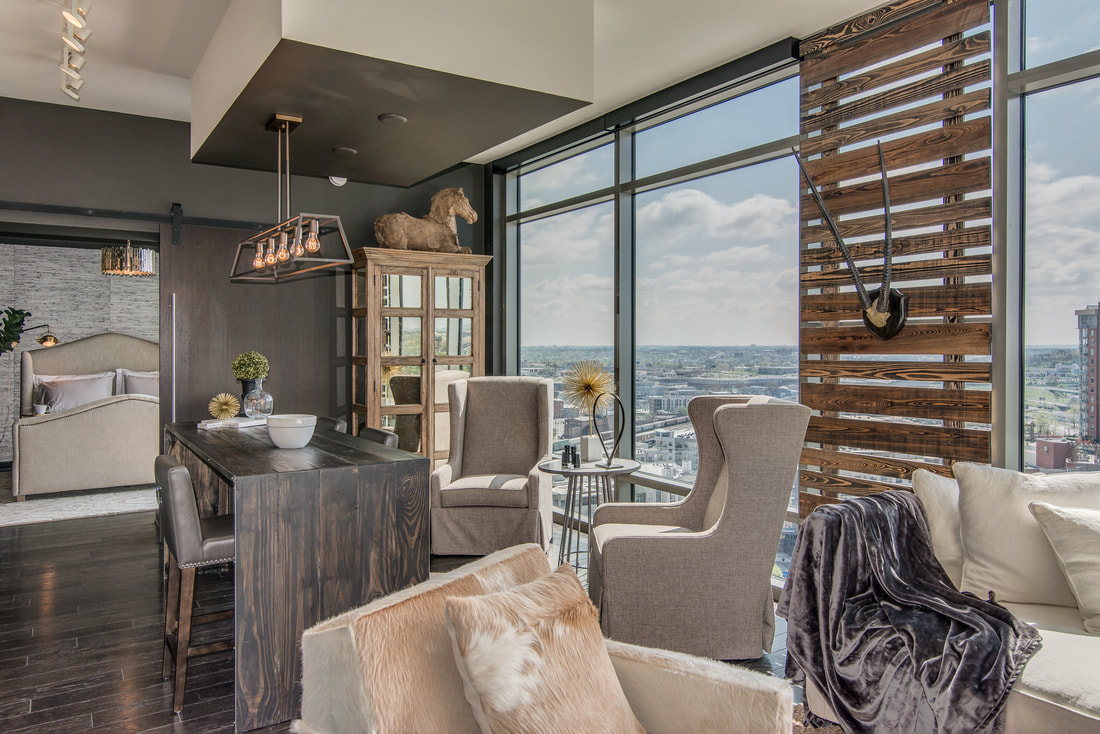 In the master bathroom all we really had to do is paint the walls super dark, and it popped. 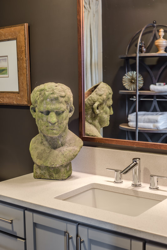 So it all flowed, we used the same color throughout the condo, even on the trim, where we used an oil-based paint so that there’s some sheen. 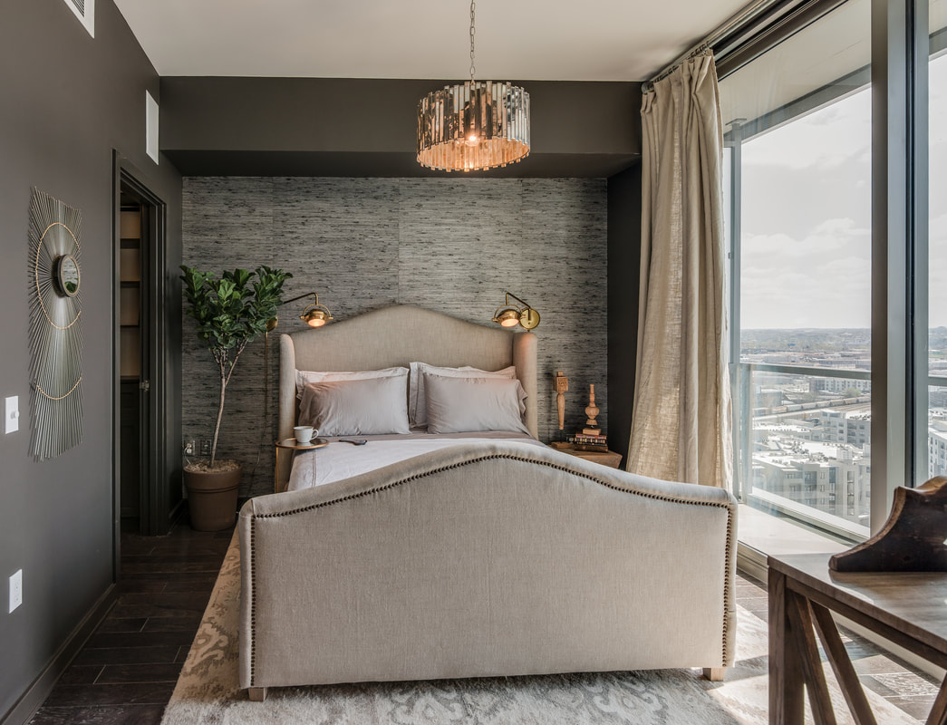 The guest bath gave me one of my first opportunities to play with wallpaper, and we selected one made of recycled newspaper shreds. 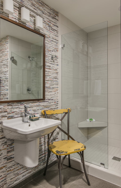 We also used a gorgeous grasscloth wallpaper in the master bedroom on the bed wall. It’s a silk-looking thing that’s the same color of the walls. 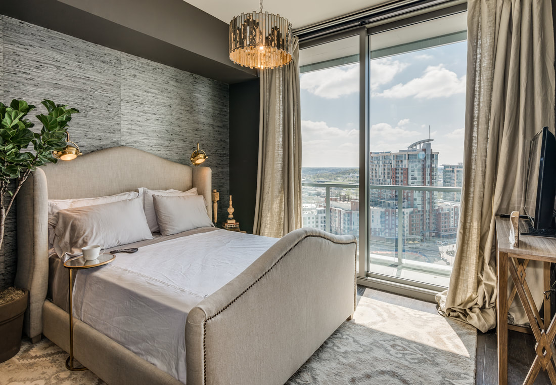 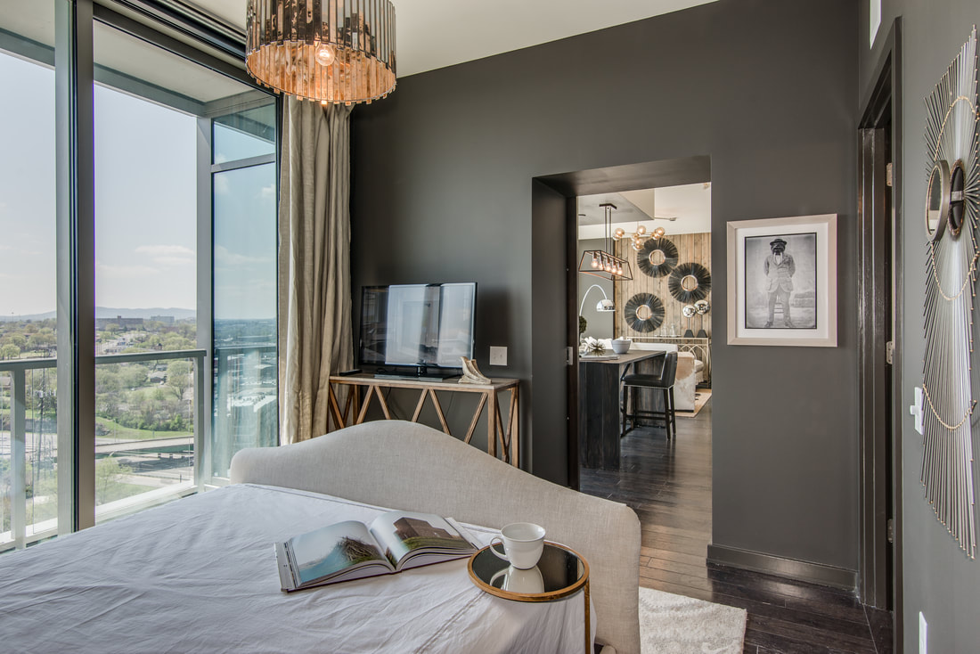 Finally, in the foyer, we again introduced an element from elsewhere in the building. There’s a lot of aged mirror in the interior design of the building, and we wanted to fully invite the vibe of this building into the unit. Rather than mirroring that whole wall we found these two fabulous screens with three panels each. We mounted them to the wall in the foyer, and put this glam white piece of furniture with gold handles in the alcove opposite it. And of course the crystal chandelier deserves mention. We wanted to wow when you walk in the door, so we swapped out one of the existing can lights for this one. 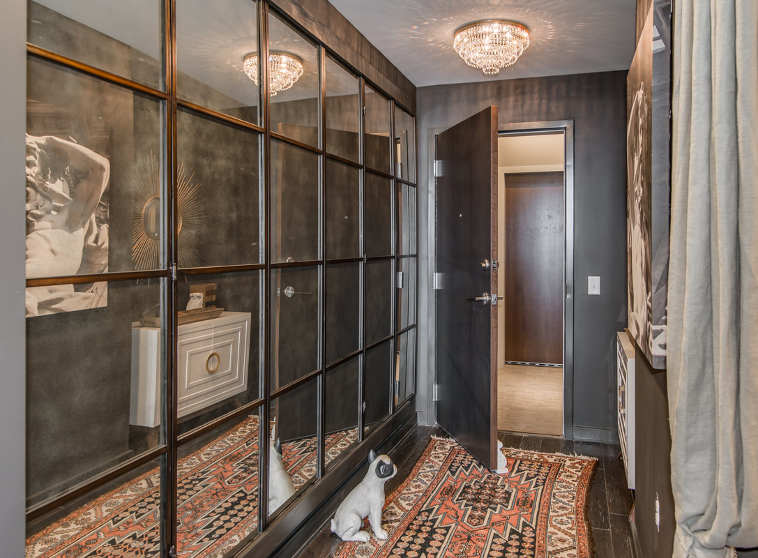 That about covers it. We’re pretty sure it shows, but we had an absolute ball conceptualizing this condo and bringing it to life. 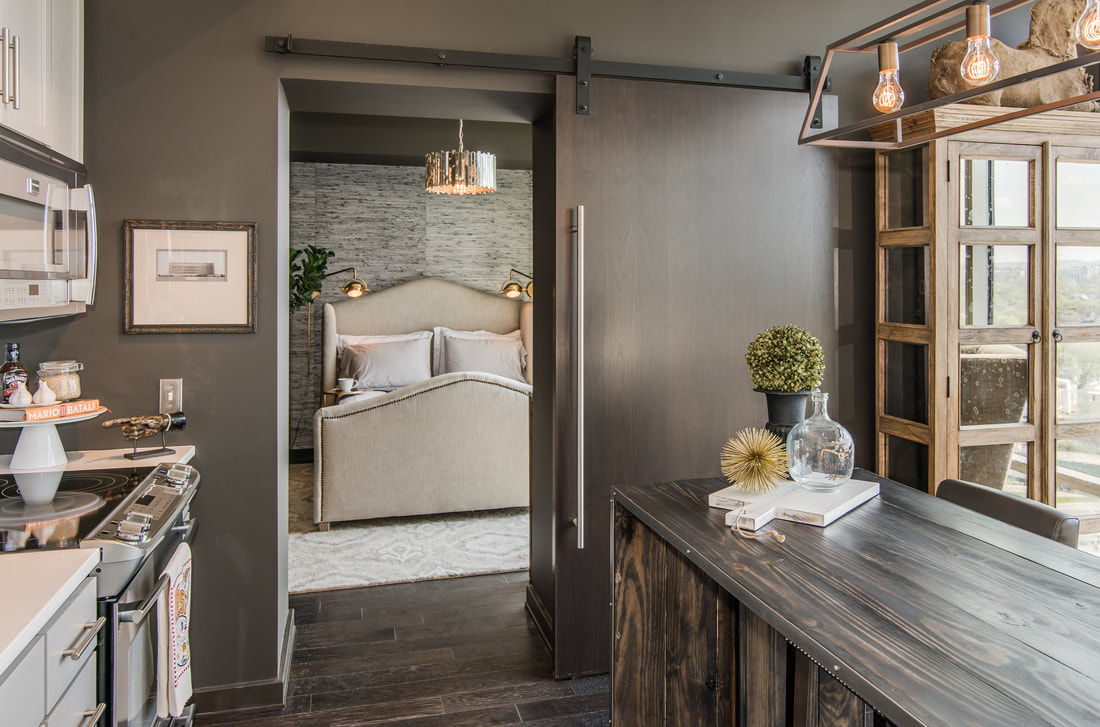 For more details on this space and the things inside it, visit our D. Luxe Home blog post or feel free to reach out to us. We are currently accepting Nashville home staging projects and would love to hear from you.
|
Dee BynumDee Bynum has his finger on the pulse. Whether it’s following trends, scouting emerging neighborhoods and infill opportunities, or overseeing the development of a design, Dee’s dedication to—or obsession with—his projects is renowned. Categories
All
|
|
|
|
615-415-7877
info@bynumdesign.com © COPYRIGHT 2022. ALL RIGHTS RESERVED.
|